Design focus
Keep the product desirable without overwhelming it with promotional elements. Across the work, the design relies on material, lighting and negative space to communicate a premium tone.
 EMAIL ZAM
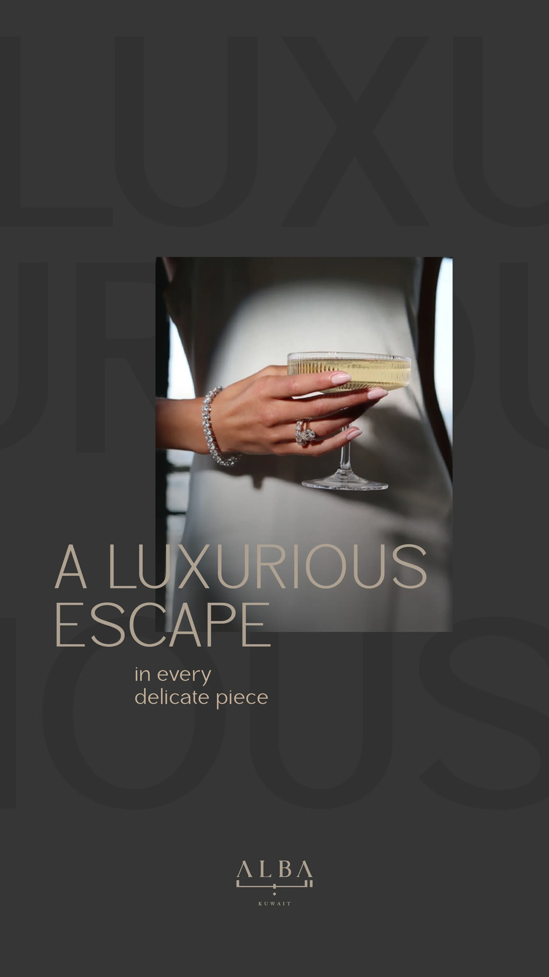
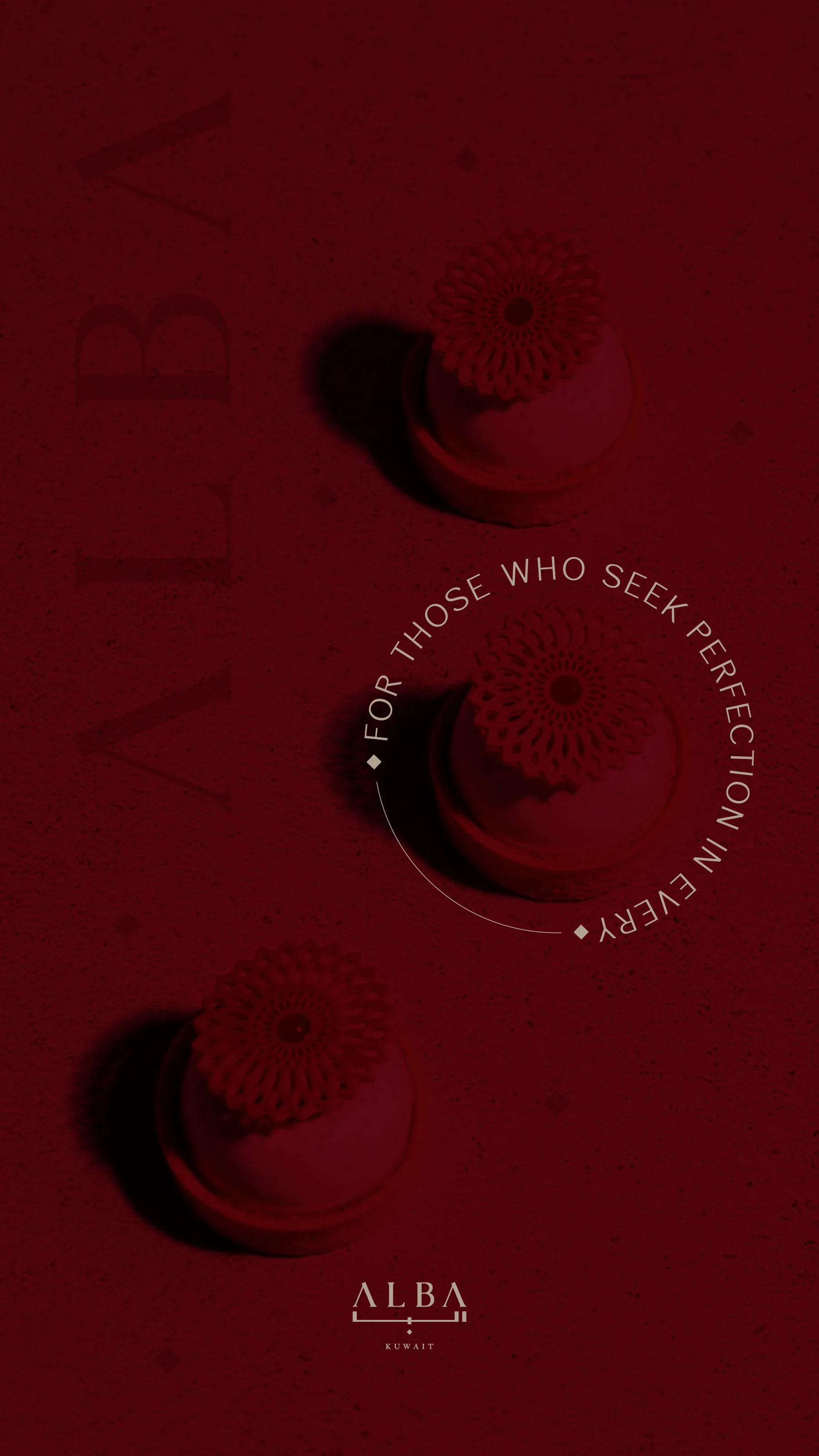
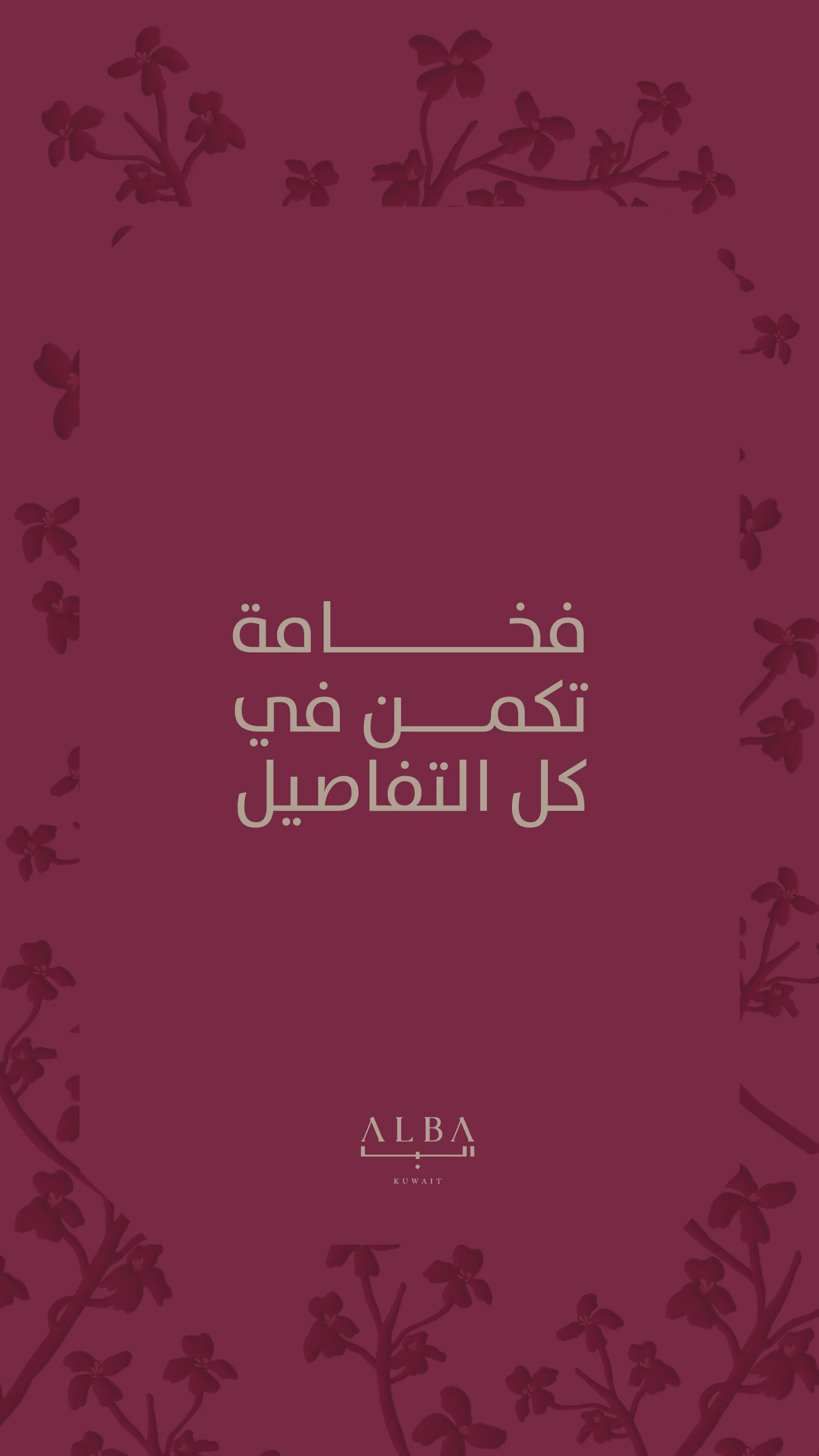
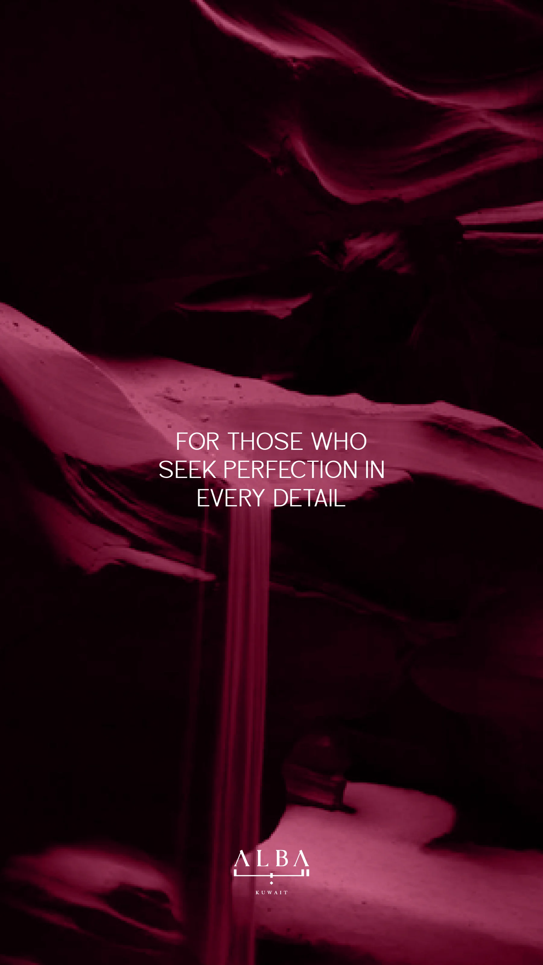
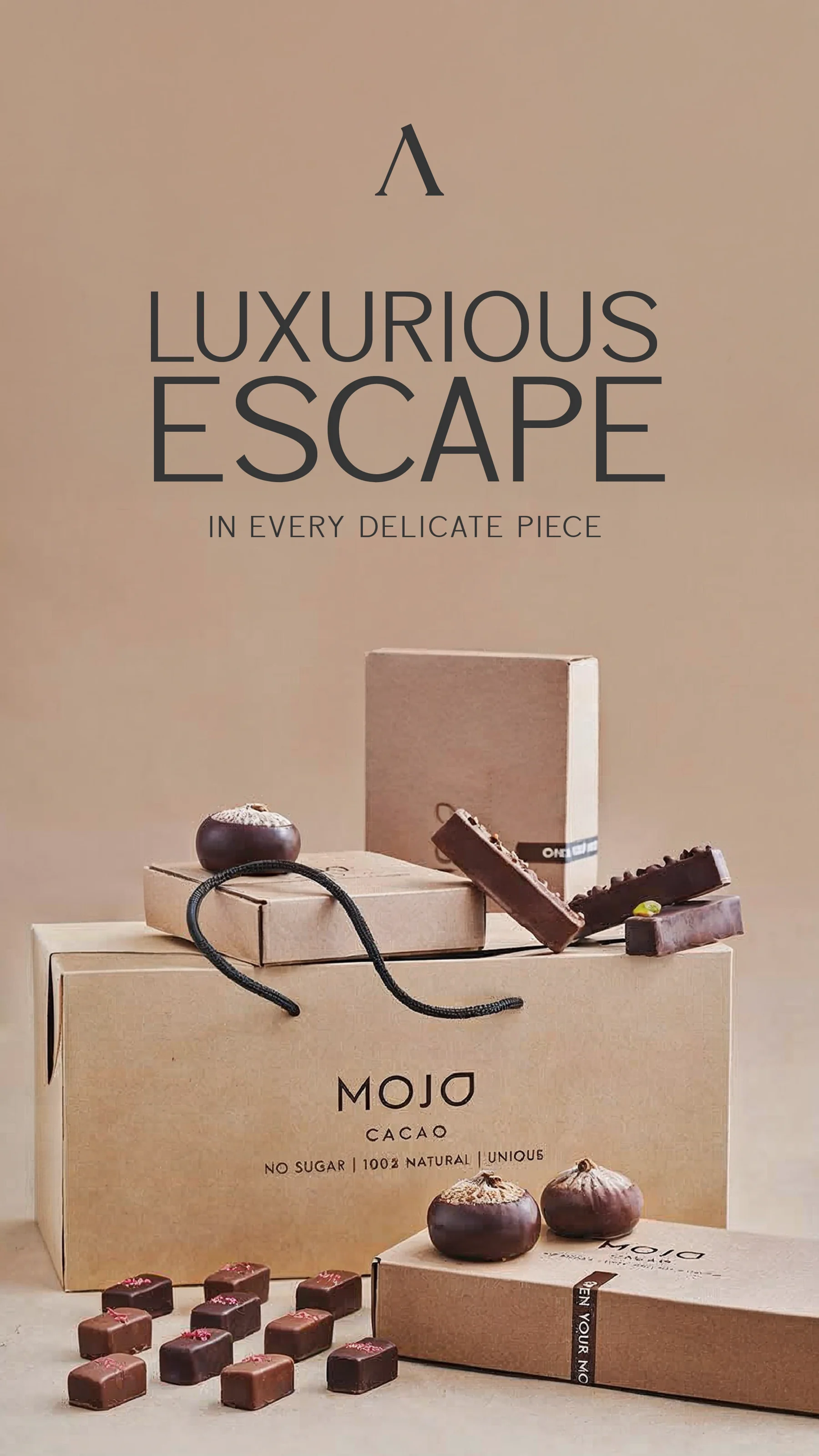
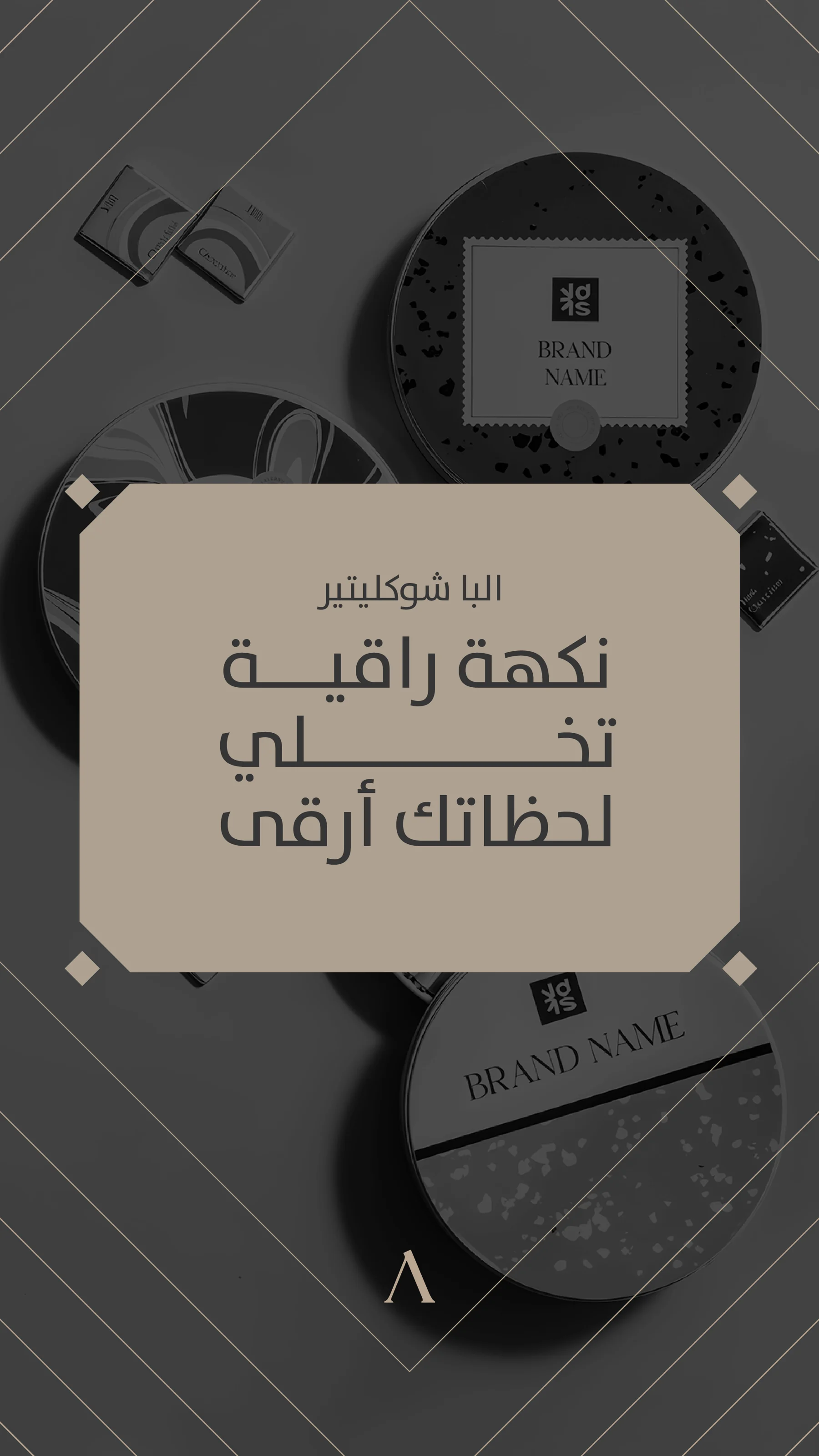
Chocolate and gifting visuals presented through restrained typography, warm neutrals and carefully lit product imagery. Burgundy and charcoal compositions add depth to the wider collection.
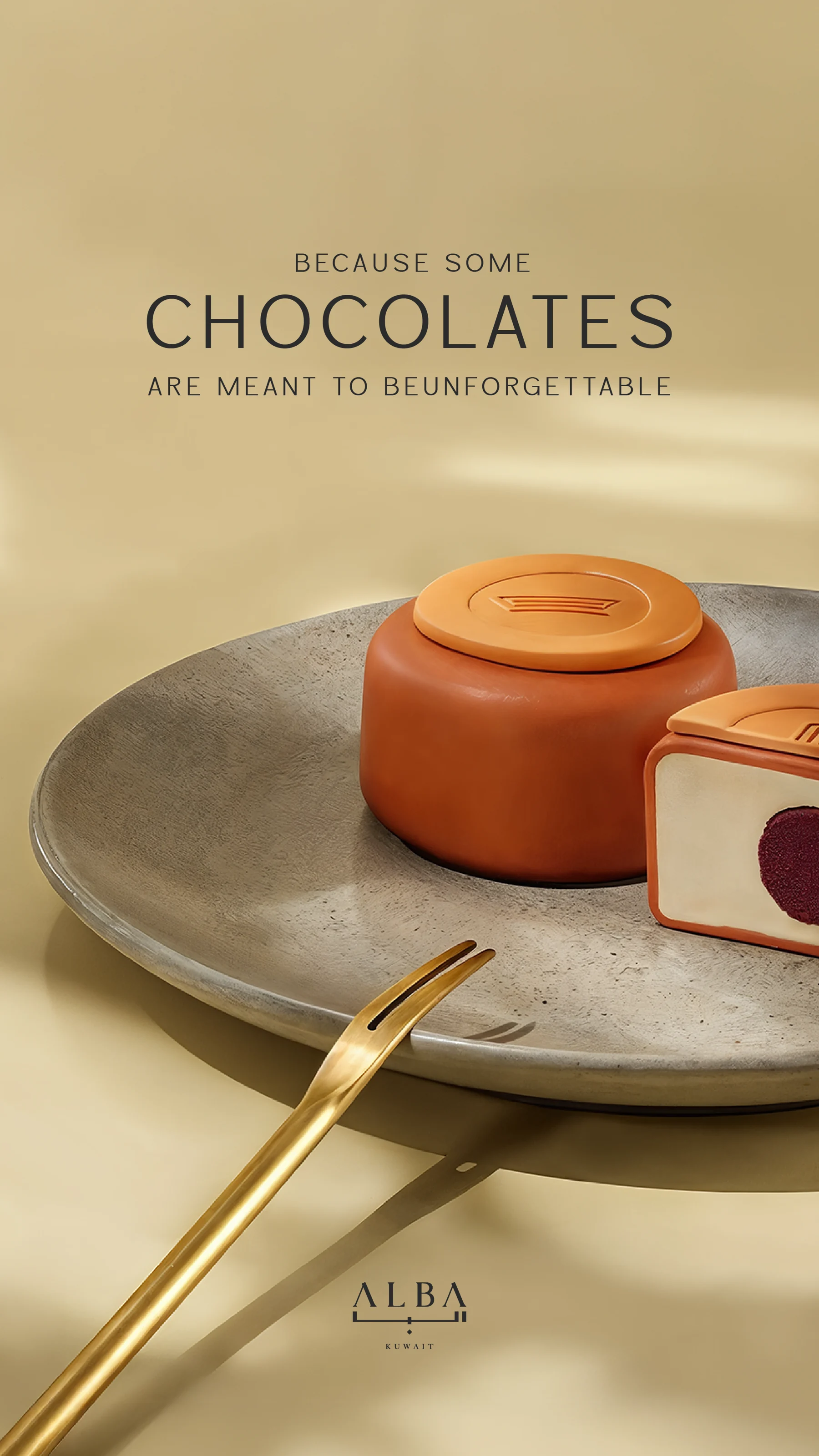
Keep the product desirable without overwhelming it with promotional elements. Across the work, the design relies on material, lighting and negative space to communicate a premium tone.
Cream and gold compositions bring out the form of the chocolates, while darker layouts shift the emphasis toward mood and gifting. Compact headlines sit away from the product, allowing texture and presentation to carry much of the message.
Individual chocolate features, gift-box imagery and typographic brand messages share a restrained hierarchy. The collection demonstrates several complementary colour treatments rather than a documented single campaign rollout.
About this case study This case study documents the visual design shown in the supplied artwork. Client commission and publication status have not been confirmed.
Planning a project with a similar design need?
EMAIL ABOUT YOUR PROJECT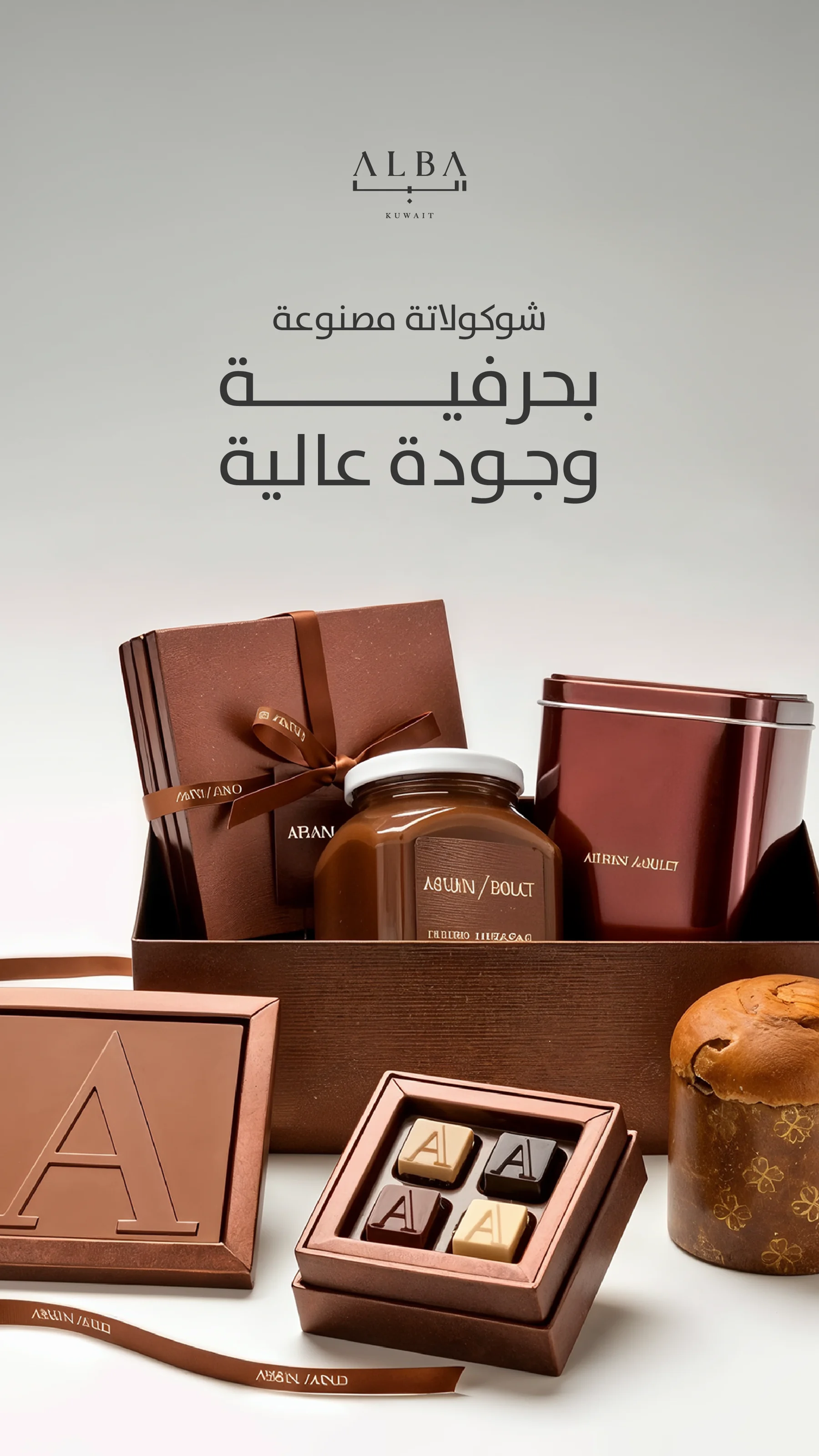
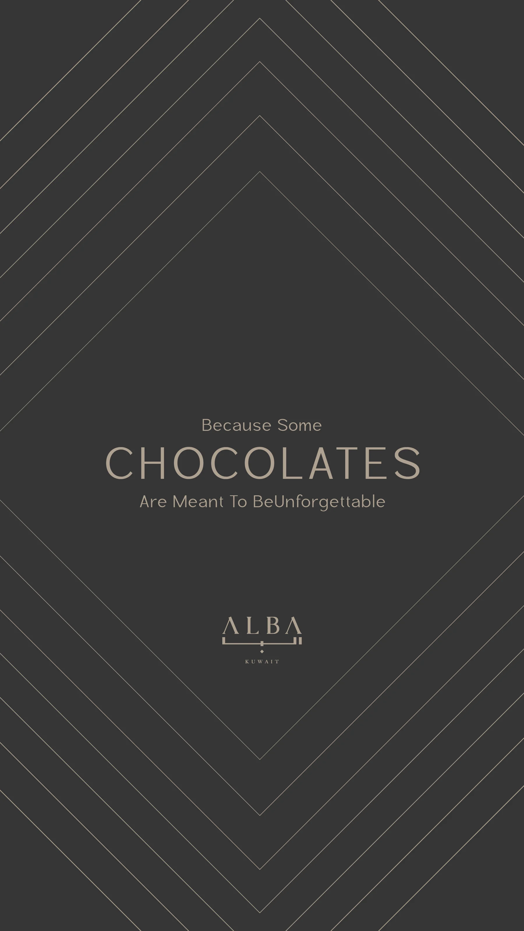
Portfolio artwork supplied by Youssef Zamzam.