Design focus
Organise a varied set of healthcare messages so that the subject, headline and brand are easy to distinguish. The collection includes different practitioners and information formats, making hierarchy central to the design.
 EMAIL ZAM
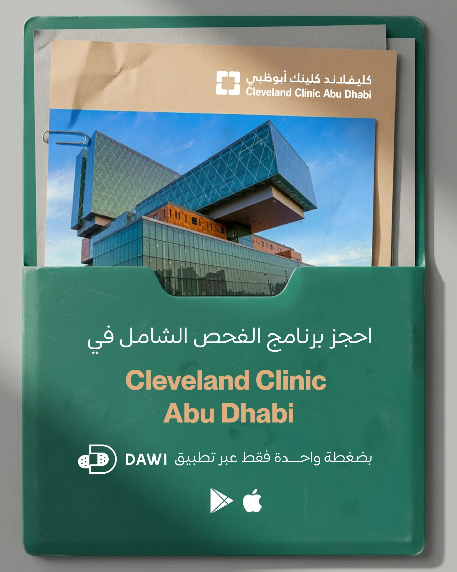
A healthcare social system combining practitioner portraits, service information and app-led messaging. Deep green, warm accents and repeated framing hold the different content types together.
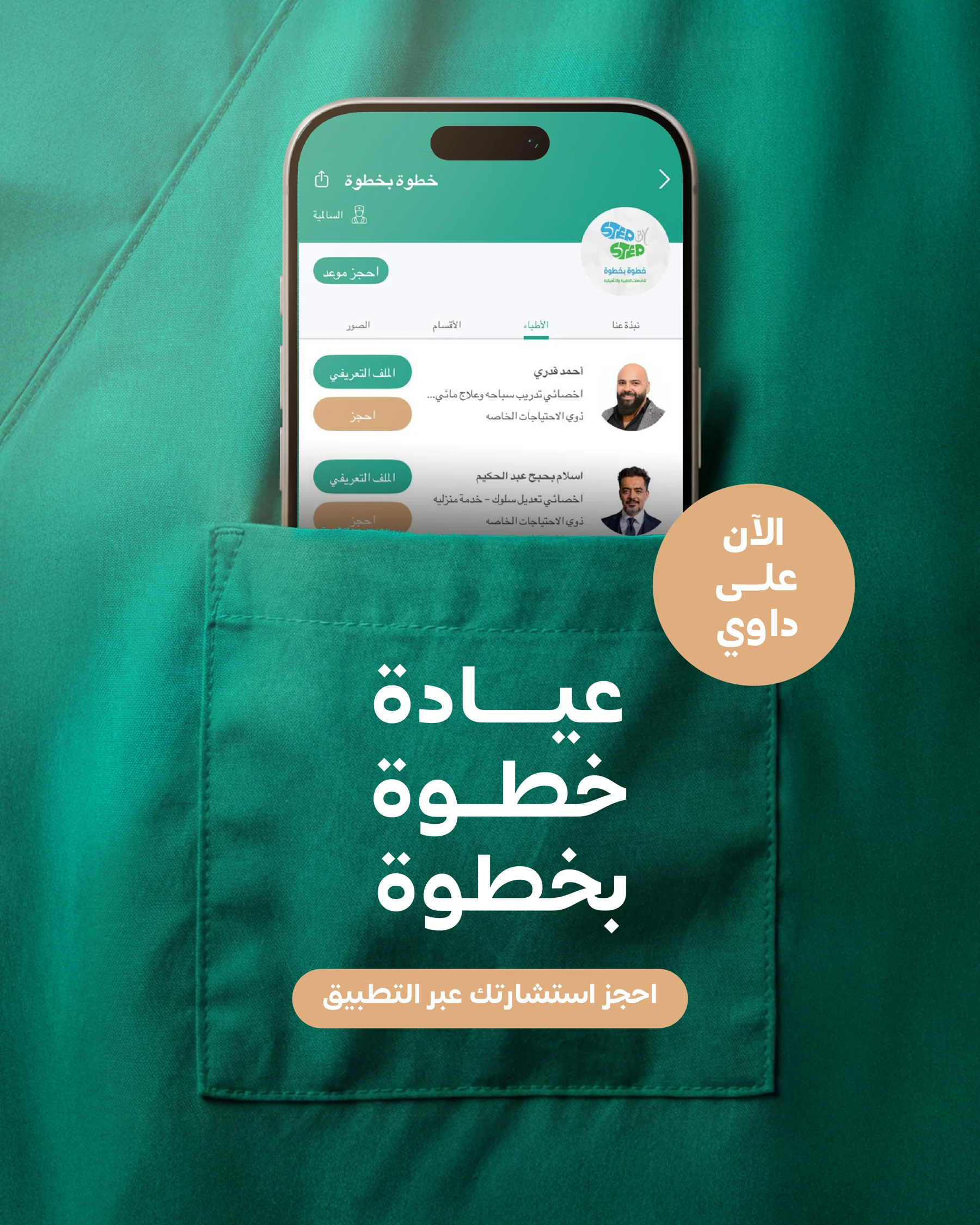
Organise a varied set of healthcare messages so that the subject, headline and brand are easy to distinguish. The collection includes different practitioners and information formats, making hierarchy central to the design.
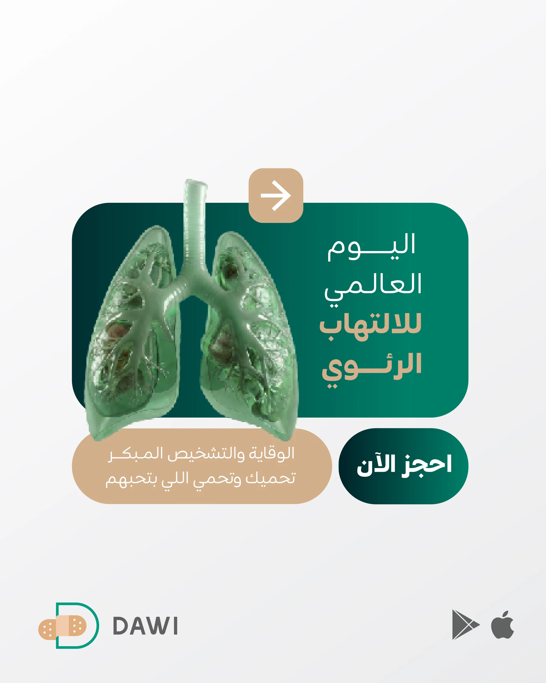
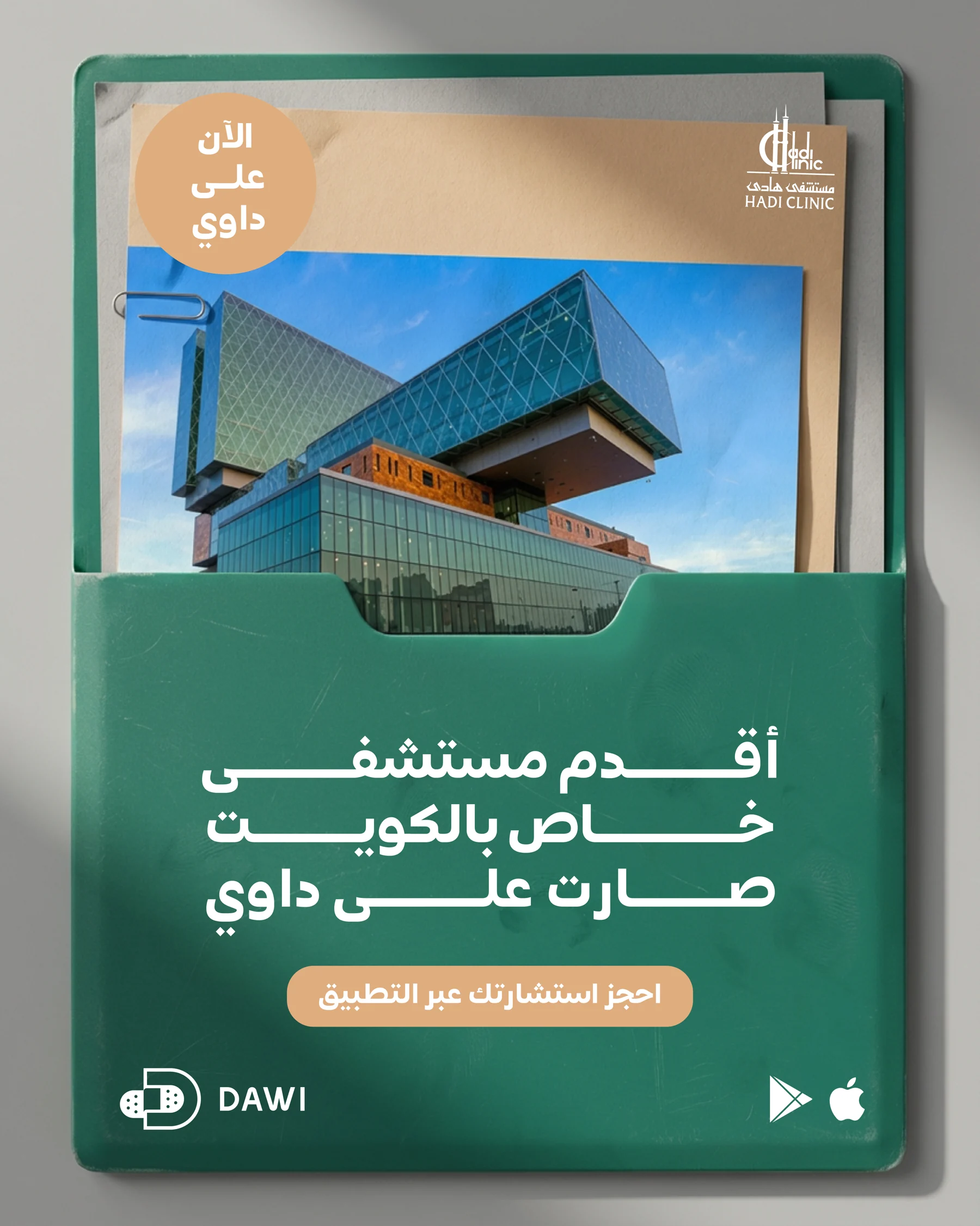
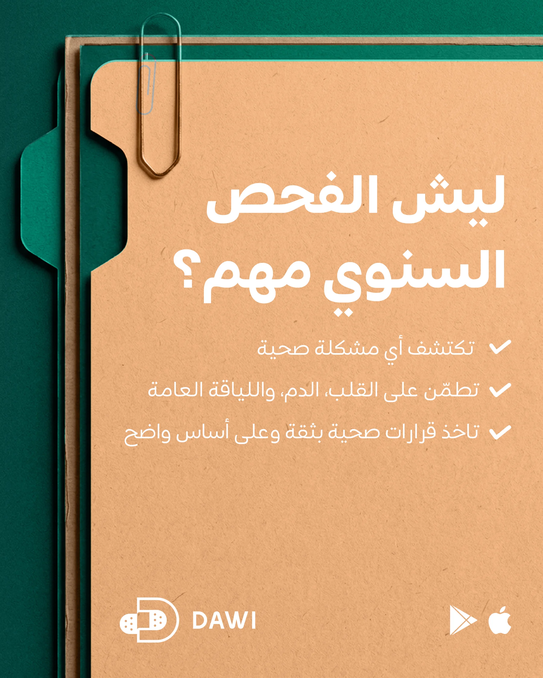
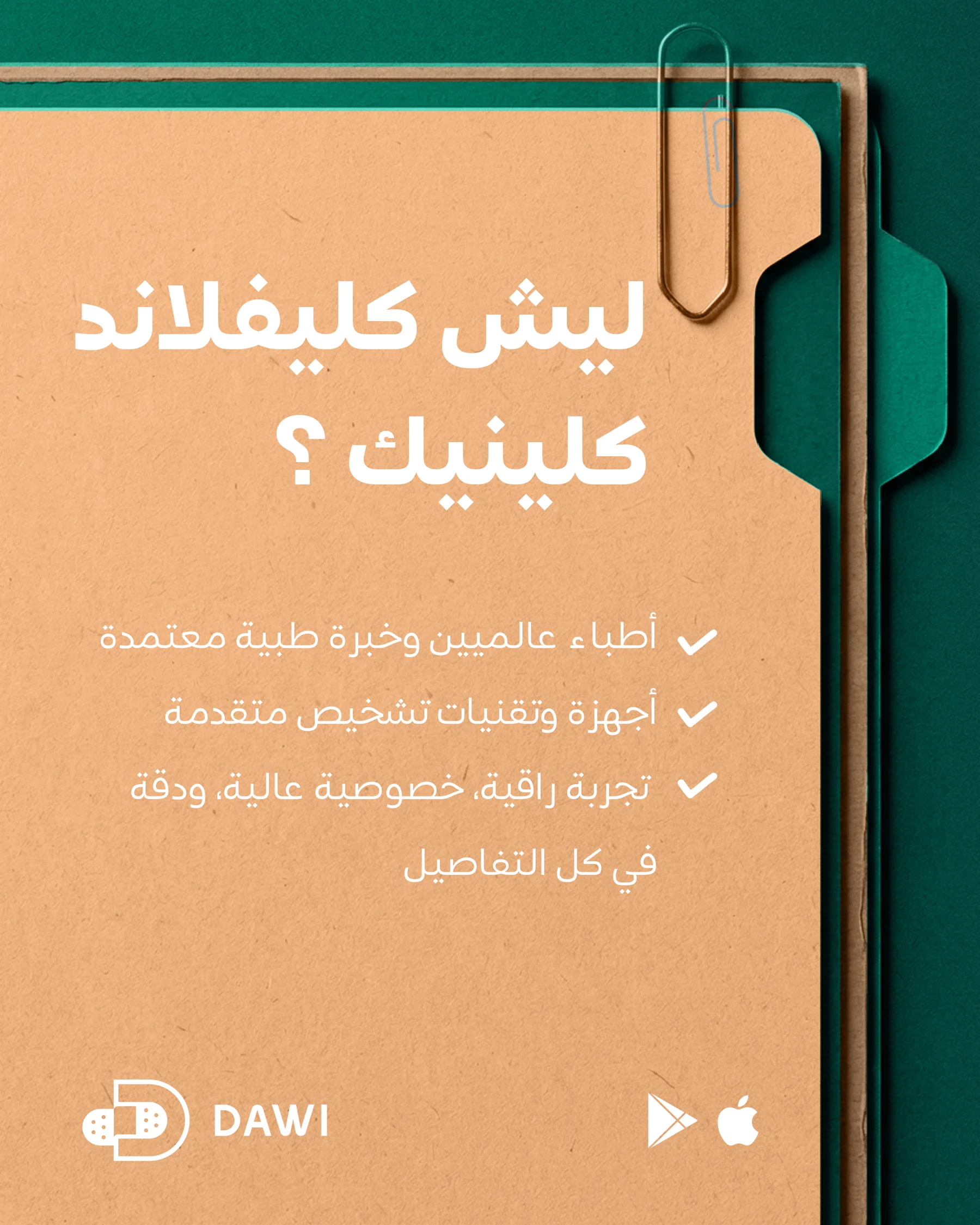
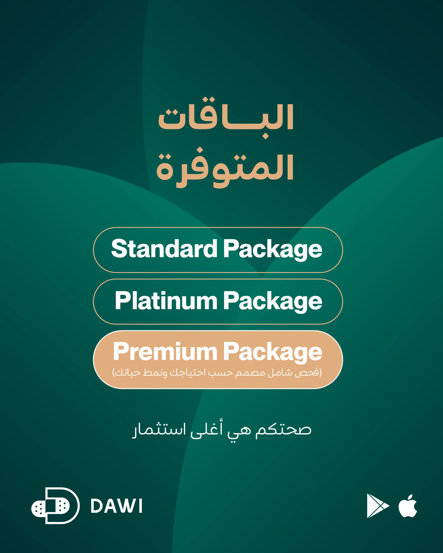
Portraits and mobile-screen compositions provide a clear focal point. Green establishes continuity, while cream and warm orange highlight supporting information. Framed panels and consistent brand placement help the more text-heavy layouts sit alongside image-led posts.
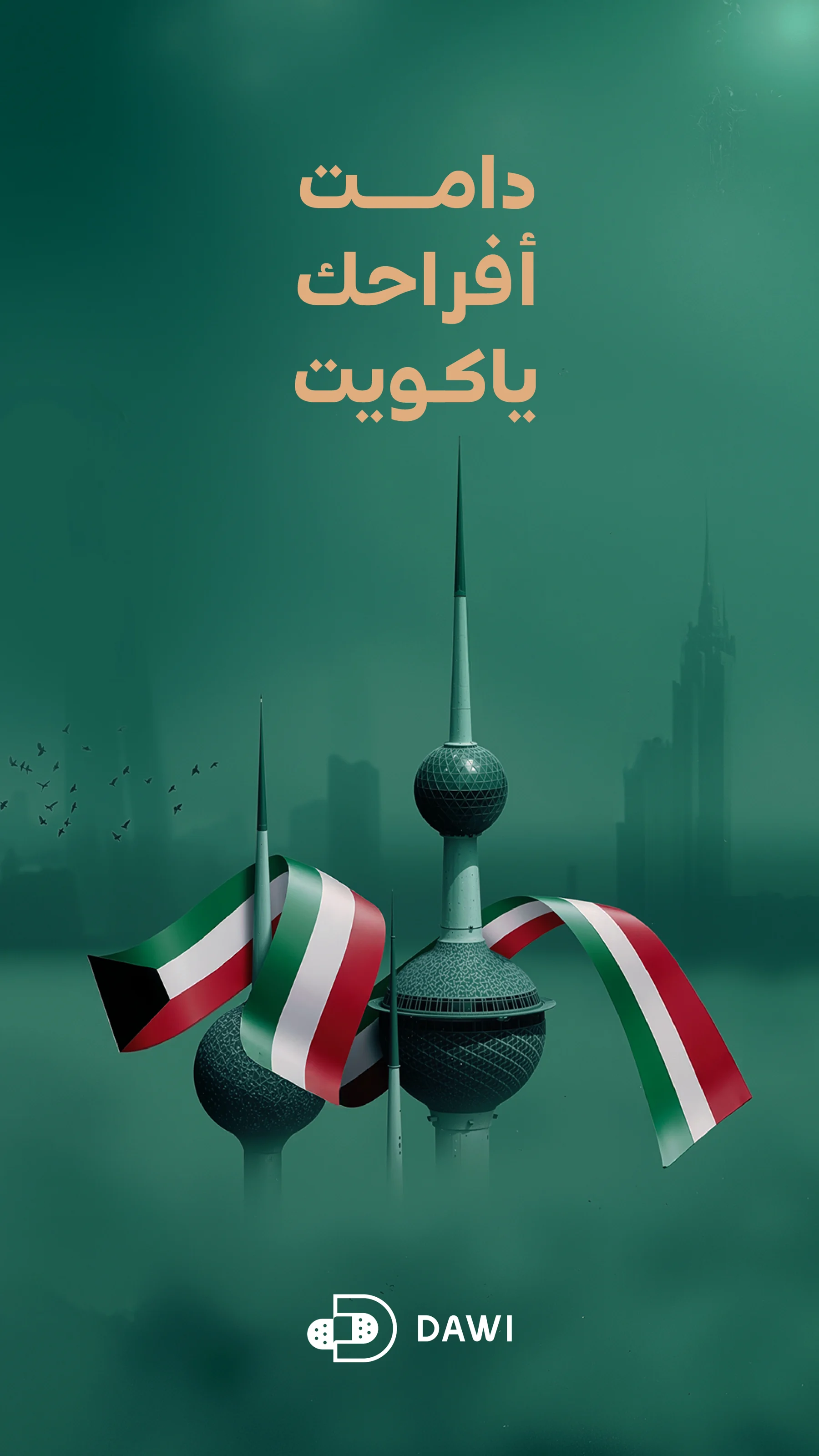
Practitioner profiles, service messages, an occasion visual and a four-part information sequence apply the same core palette. Repeated framing helps visitors recognise the source even when the subject and amount of information change.
About this case study This case study documents the visual design shown in the supplied artwork. Client commission and publication status have not been confirmed.
Planning a project with a similar design need?
EMAIL ABOUT YOUR PROJECT



Portfolio artwork supplied by Youssef Zamzam.