Design focus
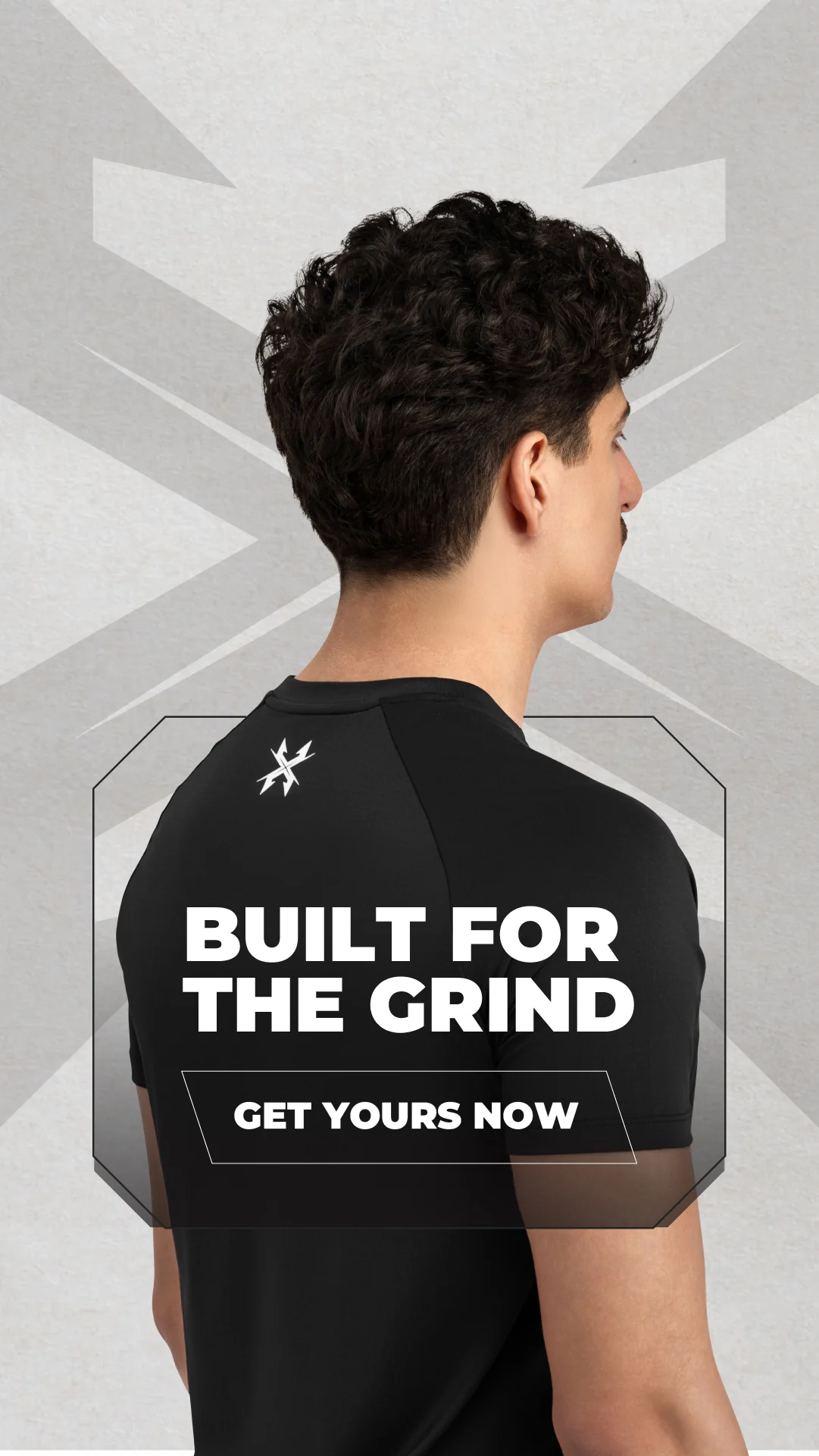
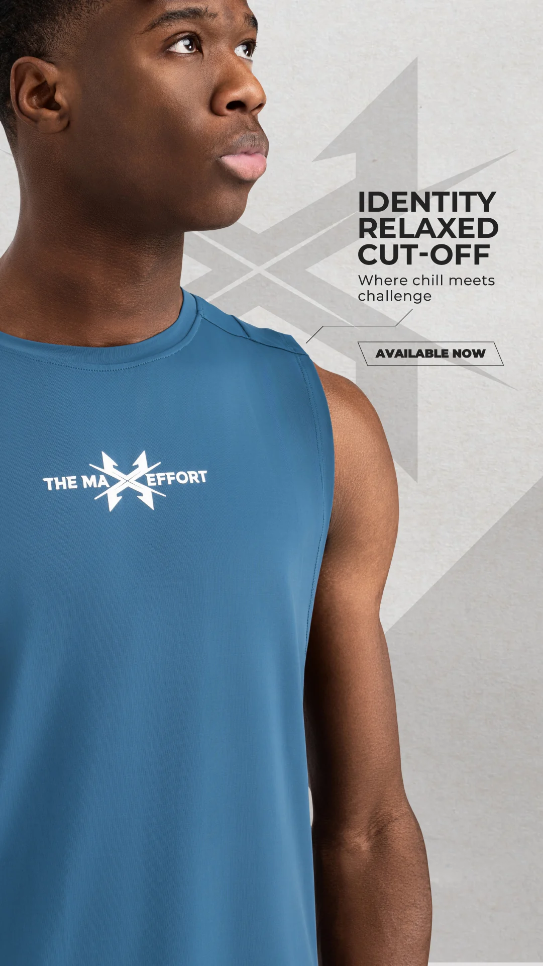
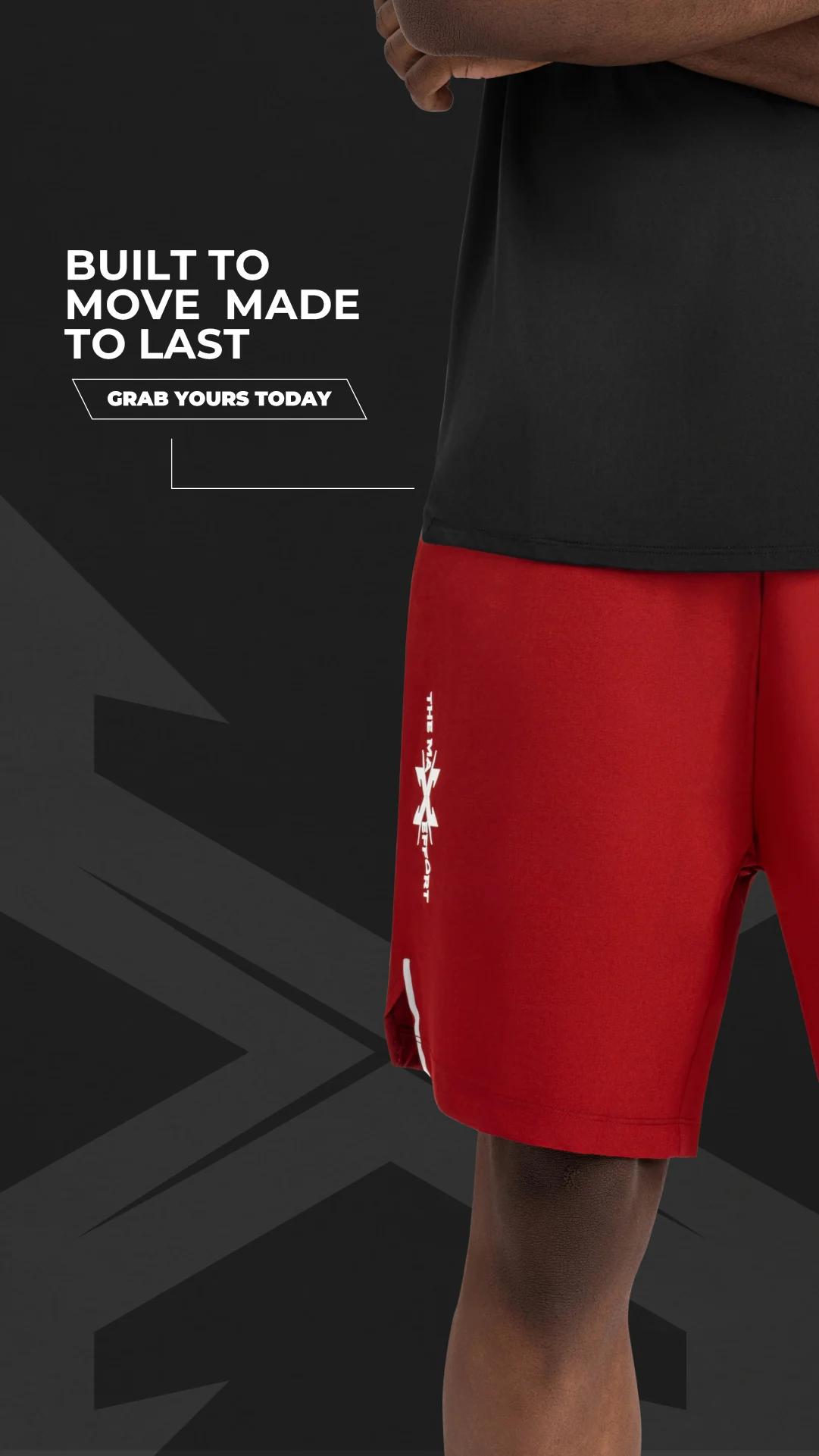
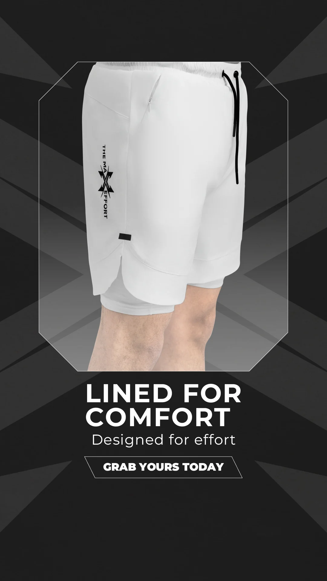
Give the garment and fit a clear visual priority while retaining room for the message. The collection explores both quieter product compositions and louder graphic treatments.
 EMAIL ZAM
An apparel collection combining oversized clothing imagery with assertive typography. Red, grey, black and white create a flexible system for product detail and brand-led statements.
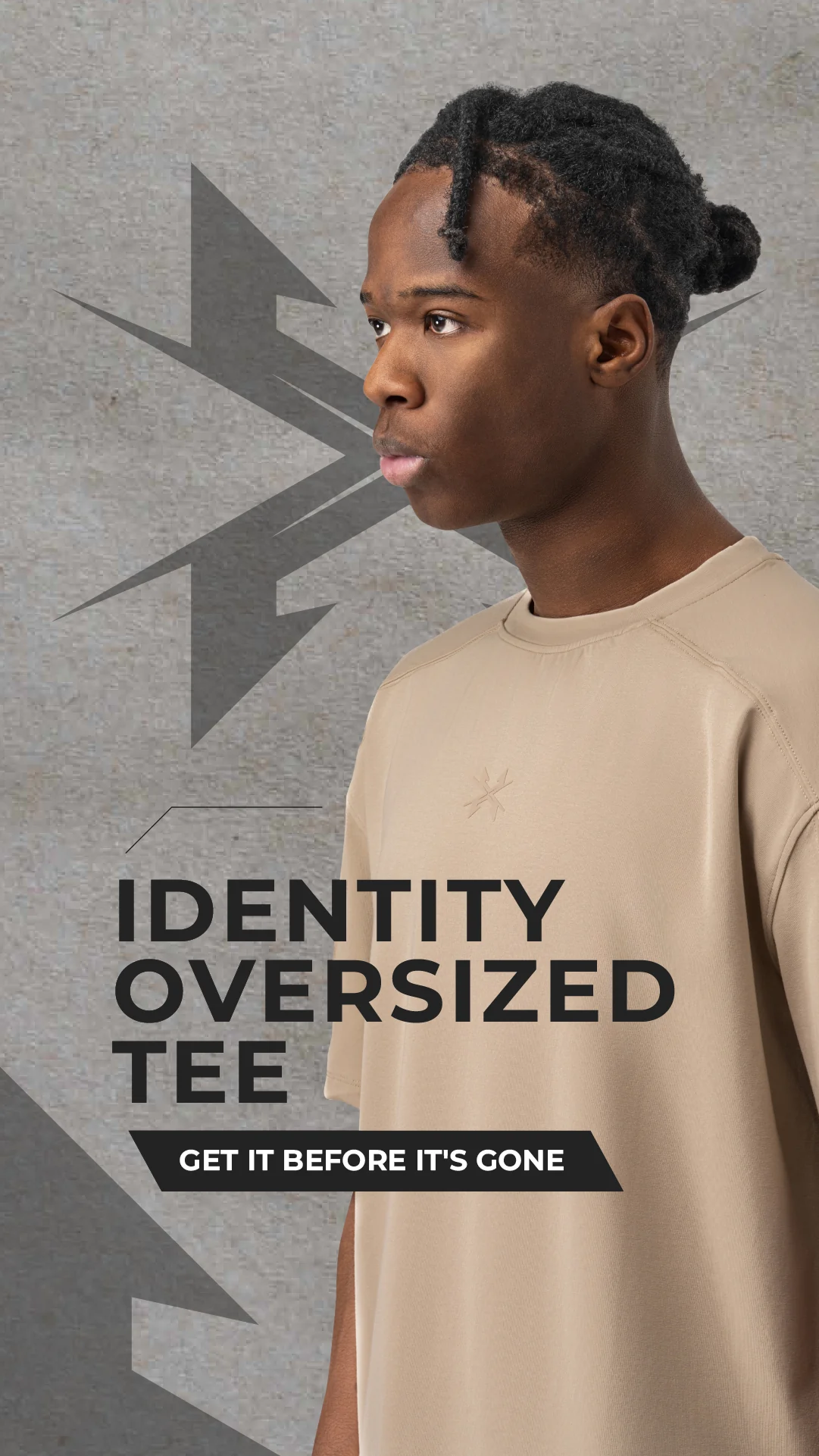
Give the garment and fit a clear visual priority while retaining room for the message. The collection explores both quieter product compositions and louder graphic treatments.
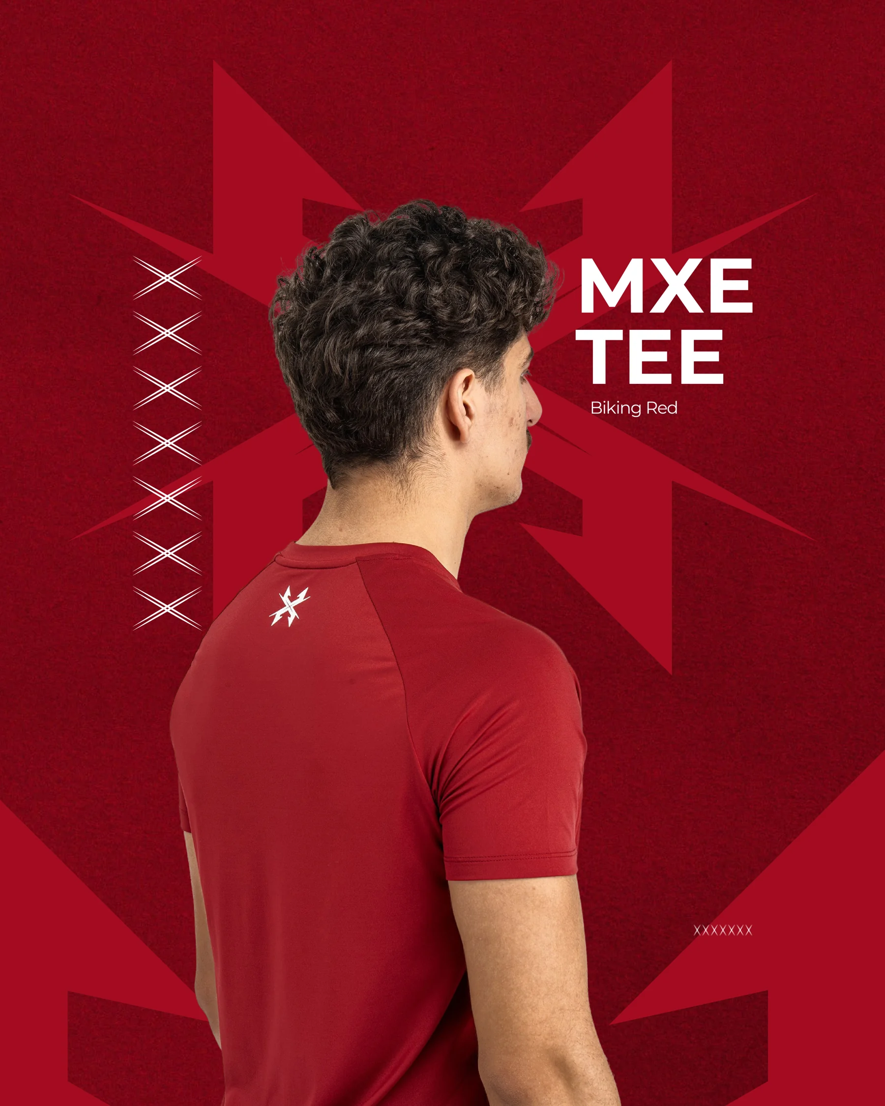
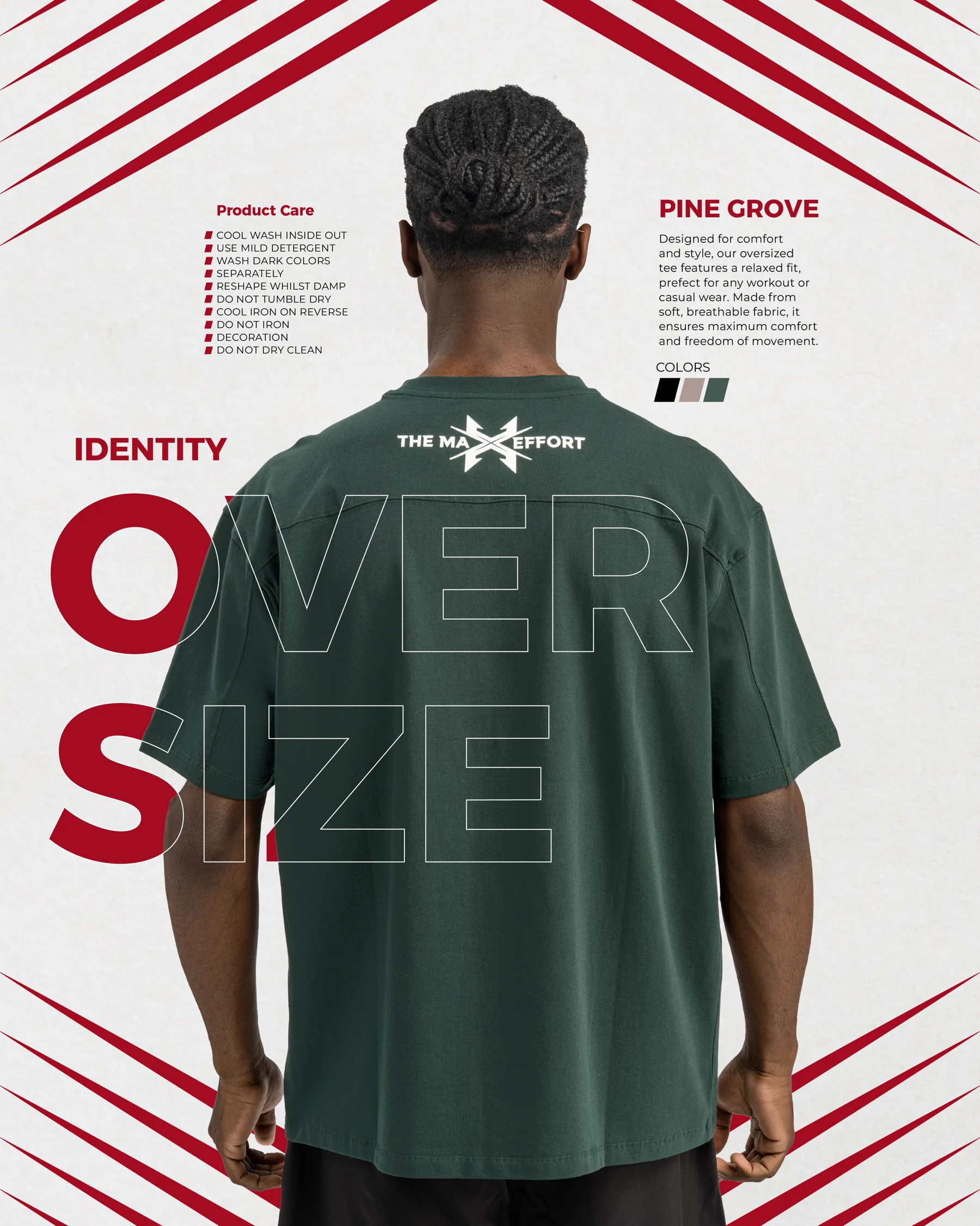
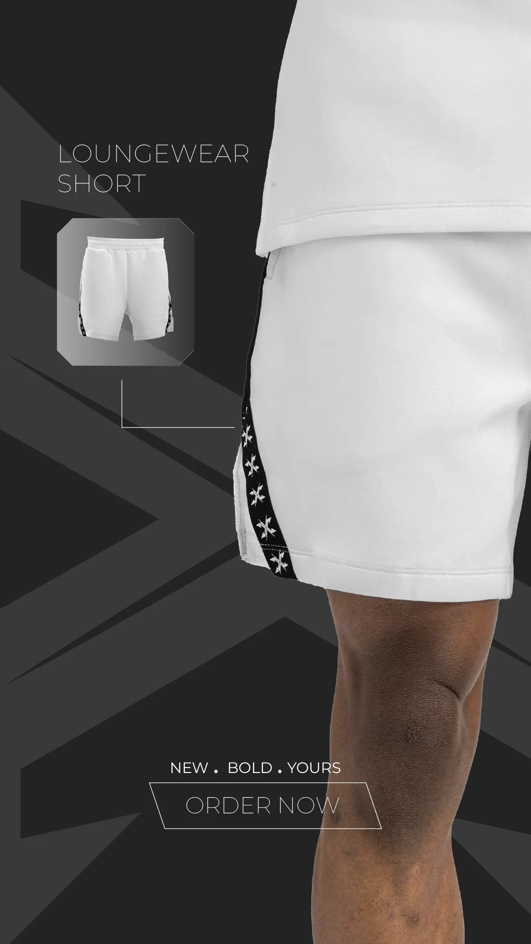
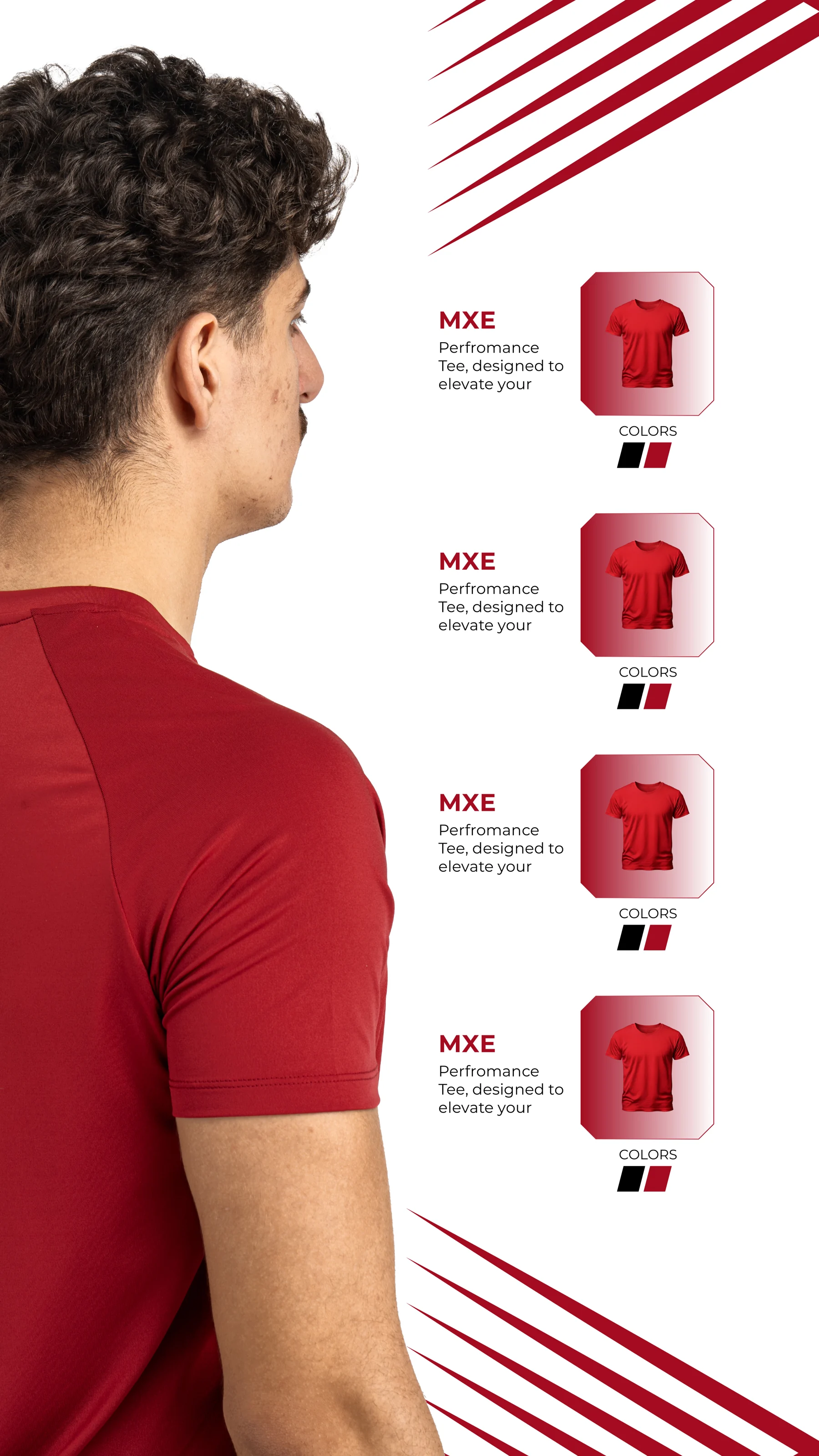
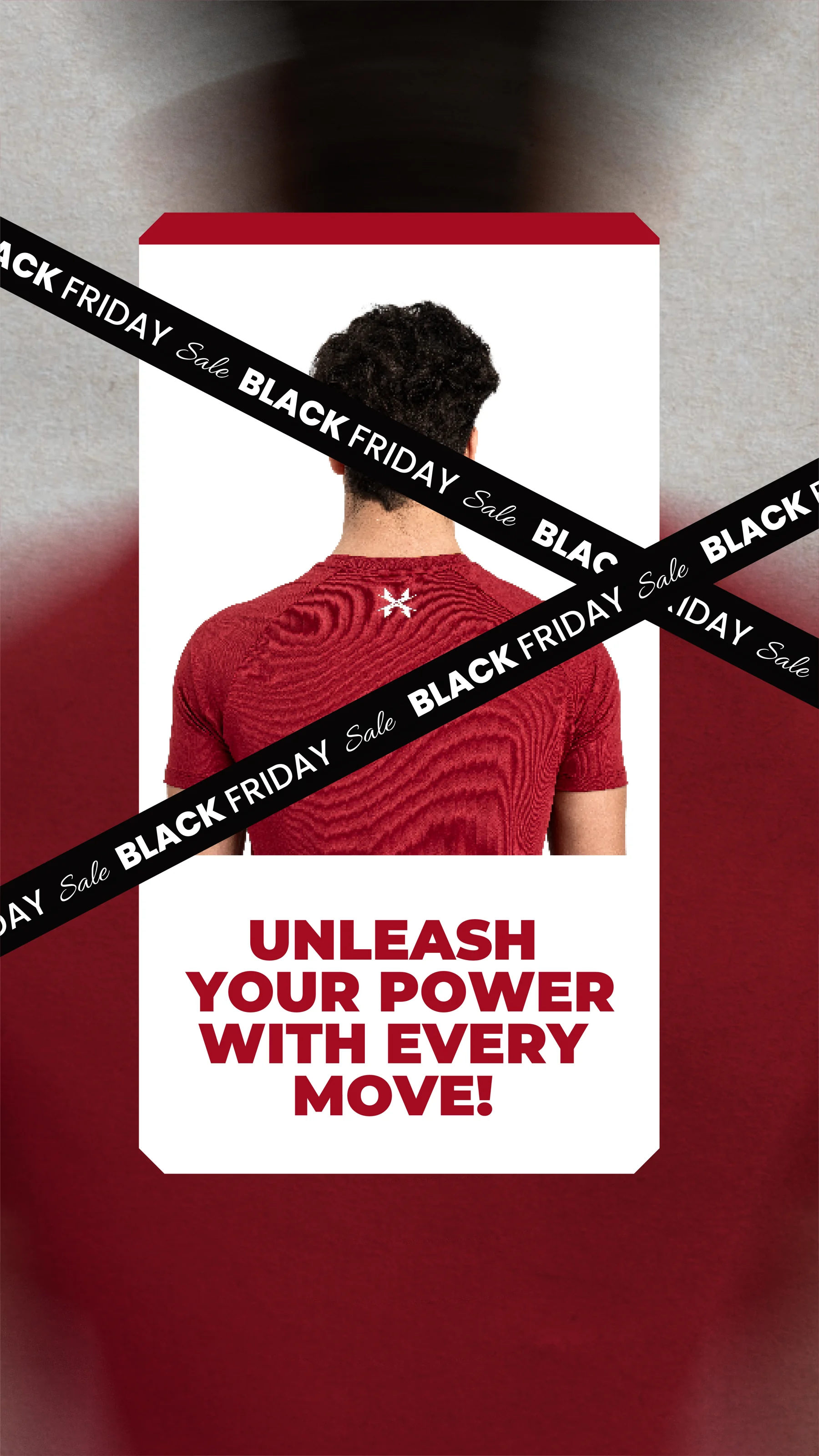
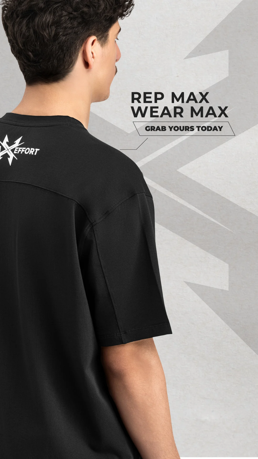
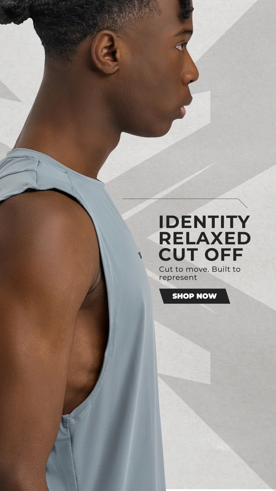
Cropped model imagery emphasises silhouette and fabric. Geometric marks and high-contrast type create continuity between the layouts, while changes in background colour shift the energy. Text is placed around the body rather than covering the main garment details.
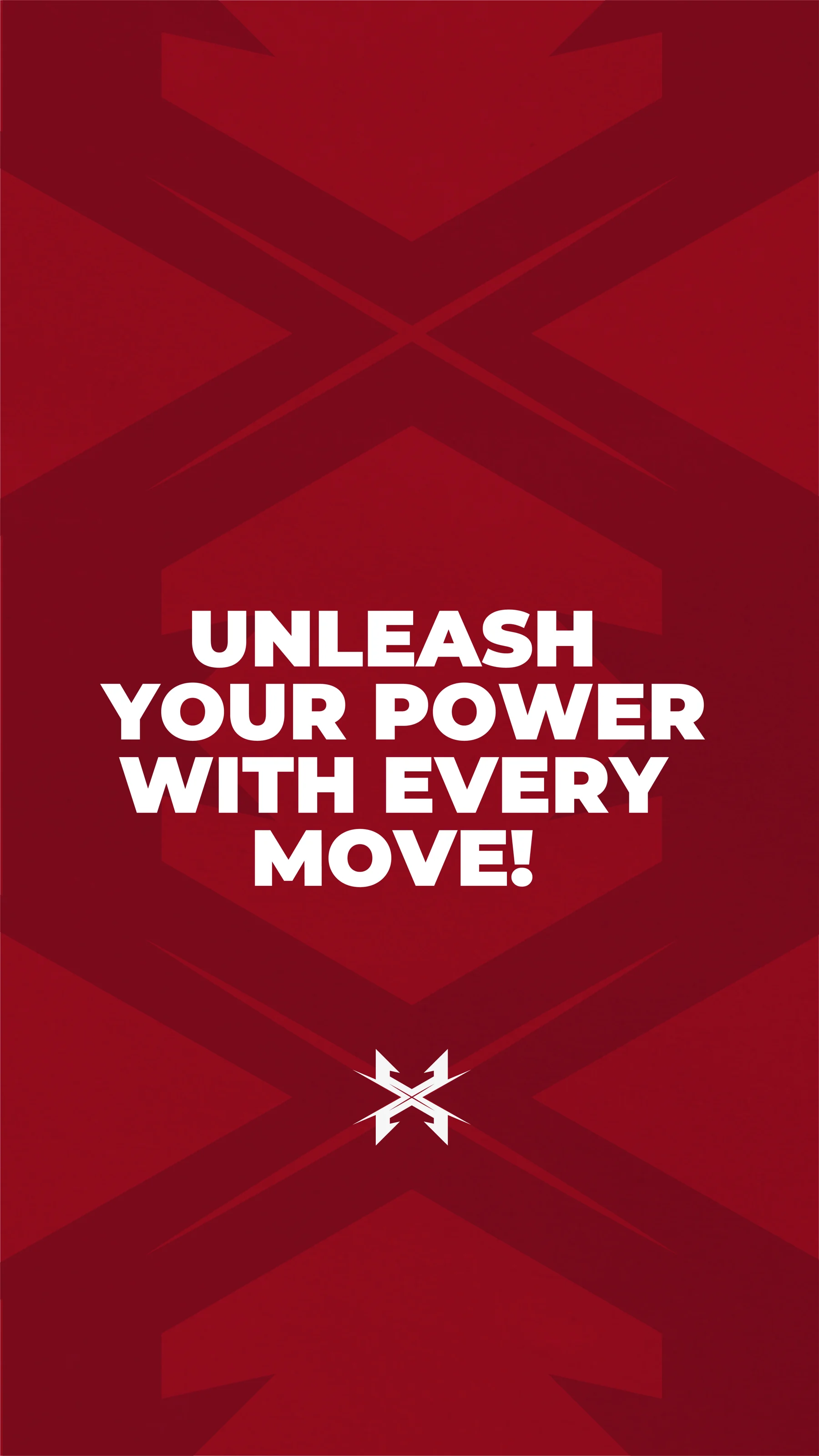
T-shirt, shorts and detail-led compositions sit alongside typographic statements. A shared graphic language connects the quieter garment features with more assertive brand-led layouts.
About this case study This case study documents the visual design shown in the supplied artwork. Client commission and publication status have not been confirmed.
Planning a project with a similar design need?
EMAIL ABOUT YOUR PROJECT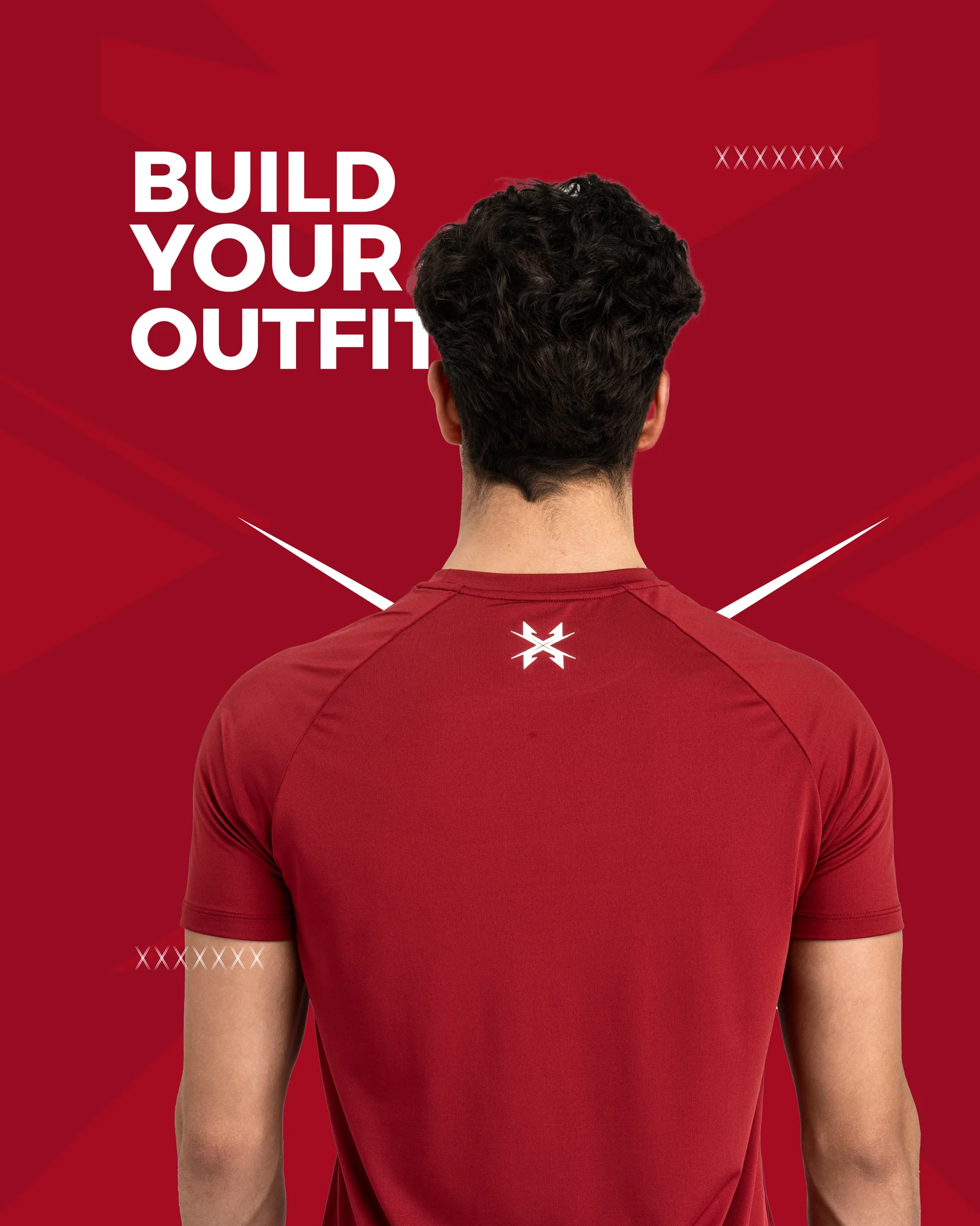
Portfolio artwork supplied by Youssef Zamzam.