Design focus
Create a recognisable fashion identity that balances expressive elegance with a clear, consistent system. The design brings the wordmark, emblem, packaging and collection imagery into one visual language.
 EMAIL ZAM
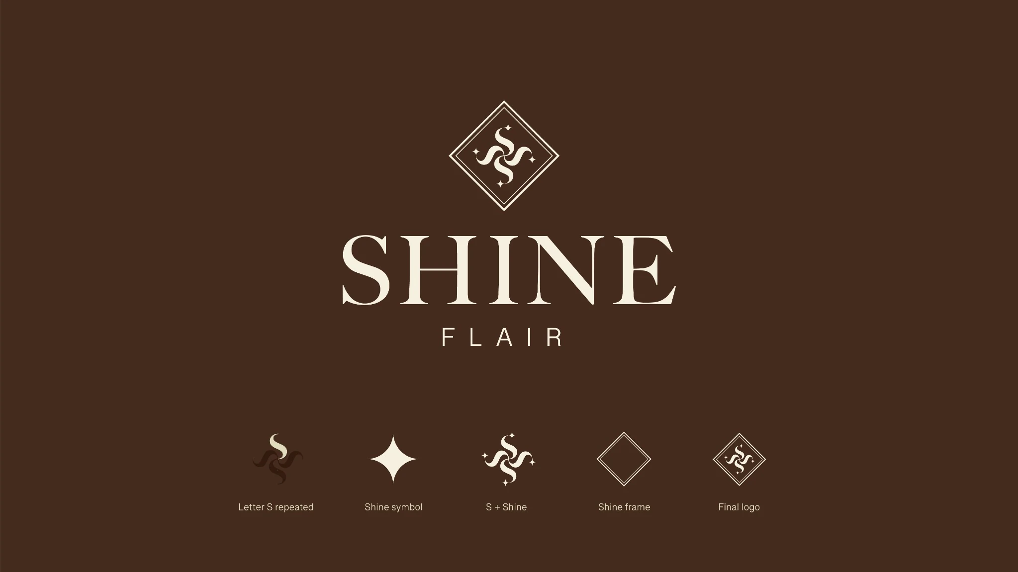
A fashion identity built around modern femininity and timeless elegance. A repeated-S emblem, chocolate-and-ivory palette and editorial image direction connect the brand across packaging, print and social campaigns.
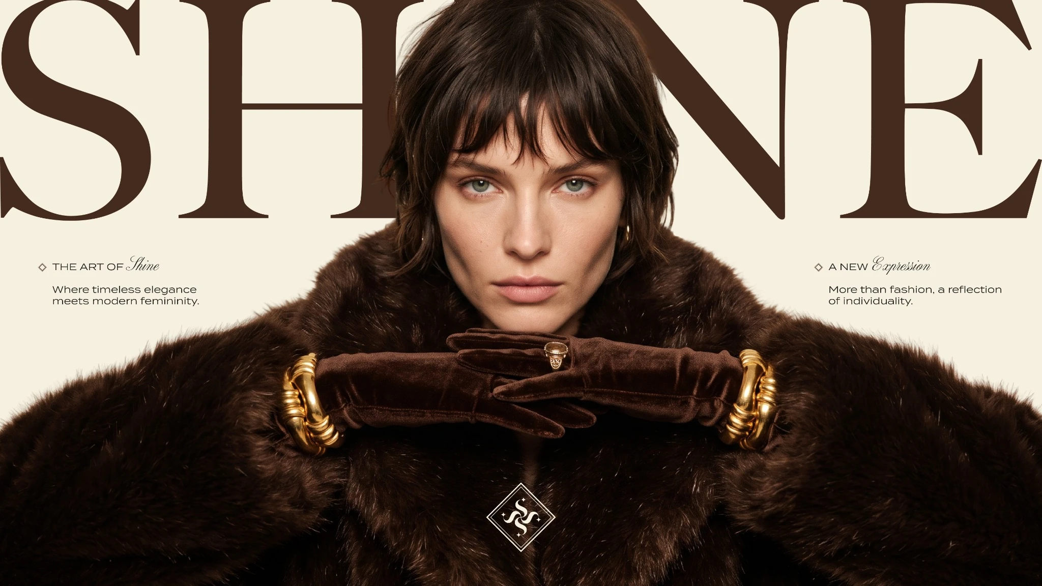
Create a recognisable fashion identity that balances expressive elegance with a clear, consistent system. The design brings the wordmark, emblem, packaging and collection imagery into one visual language.
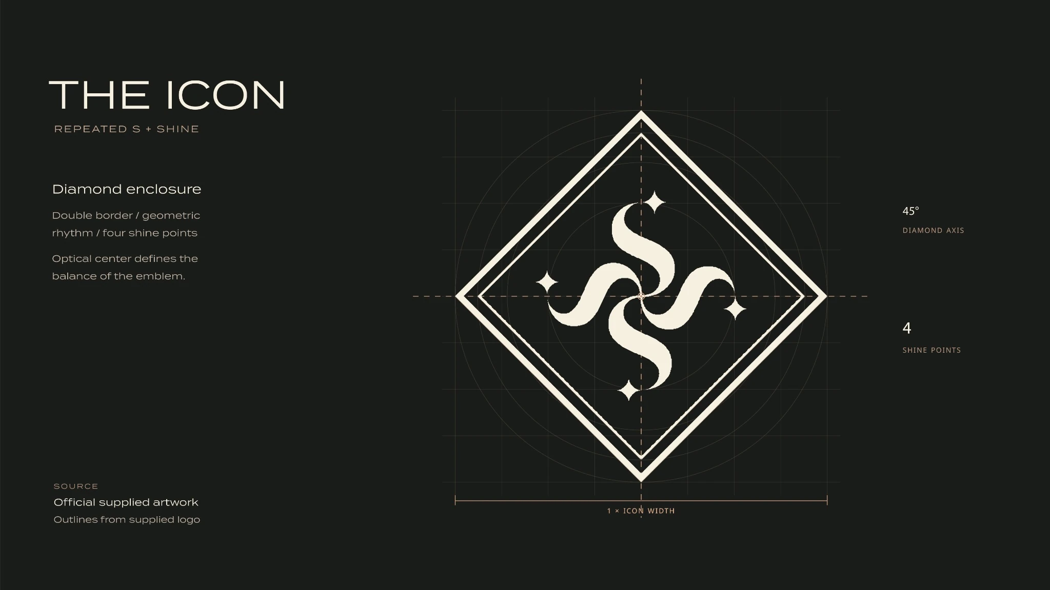
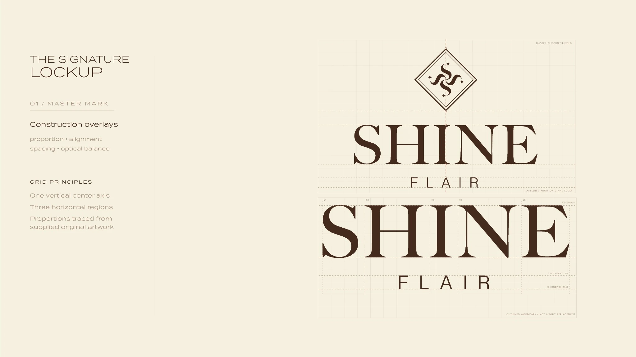
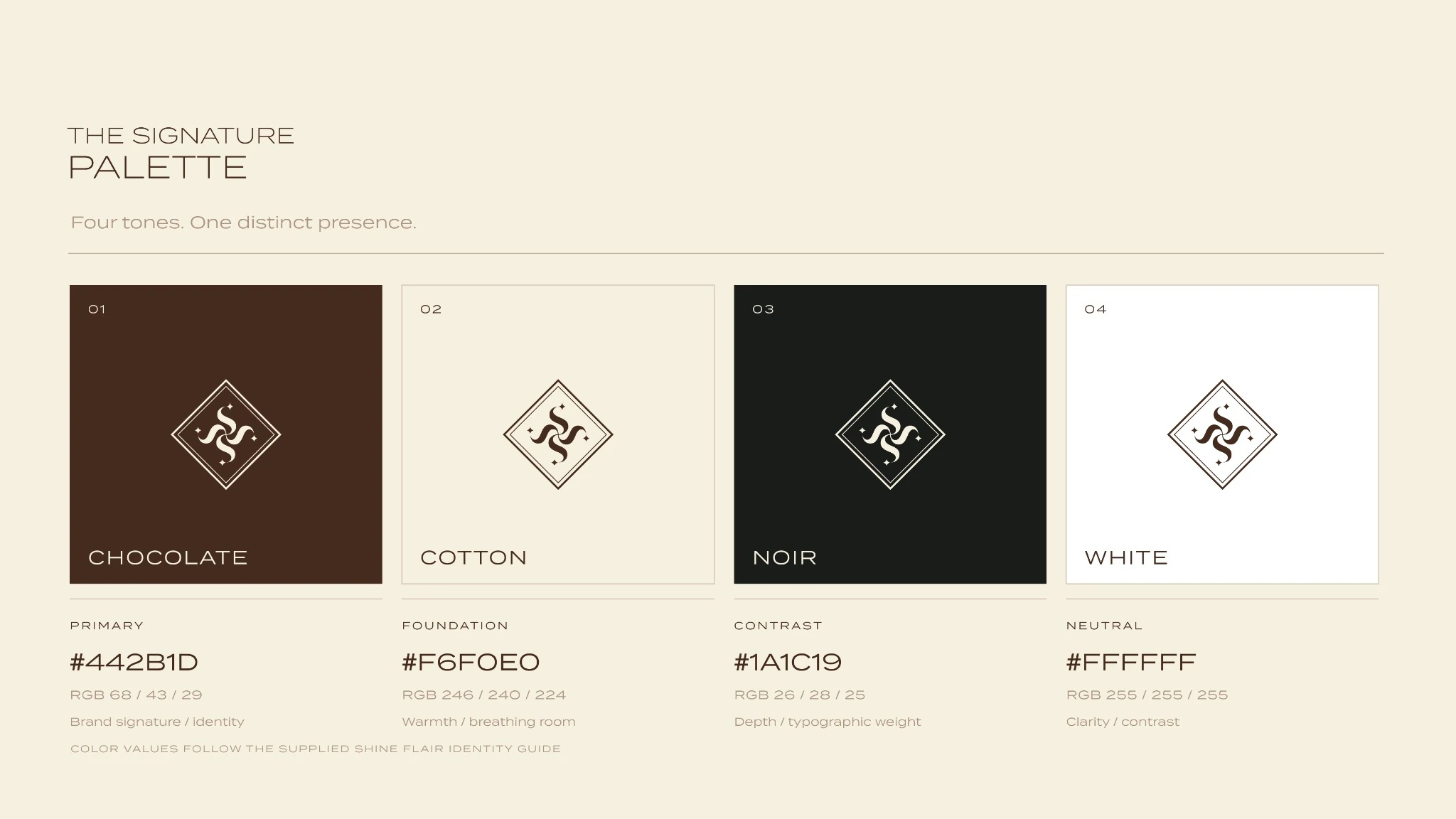
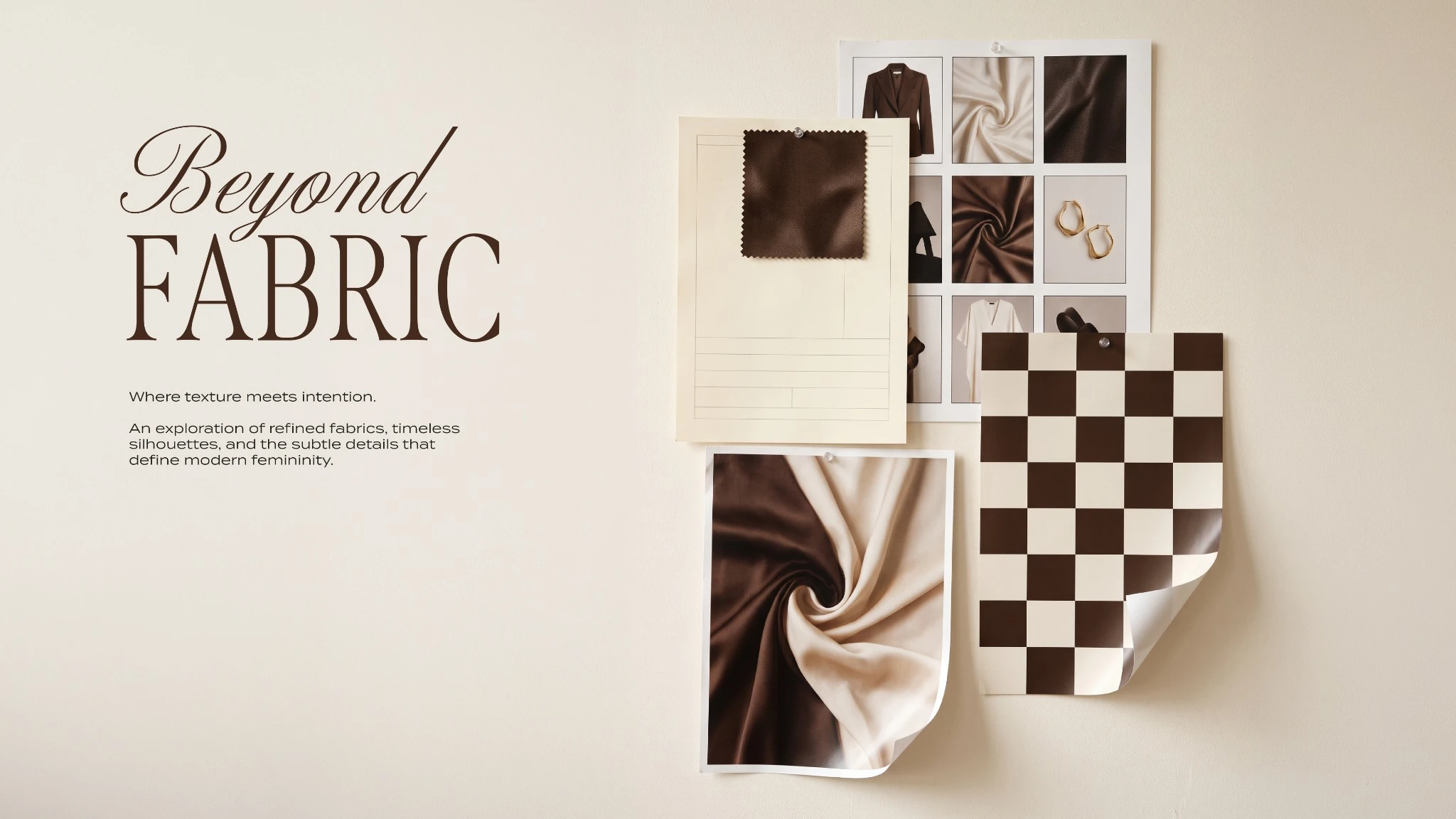
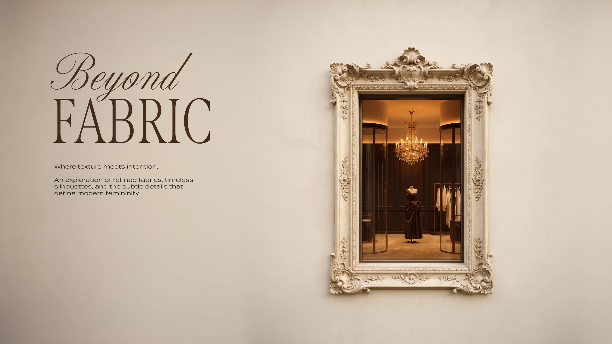
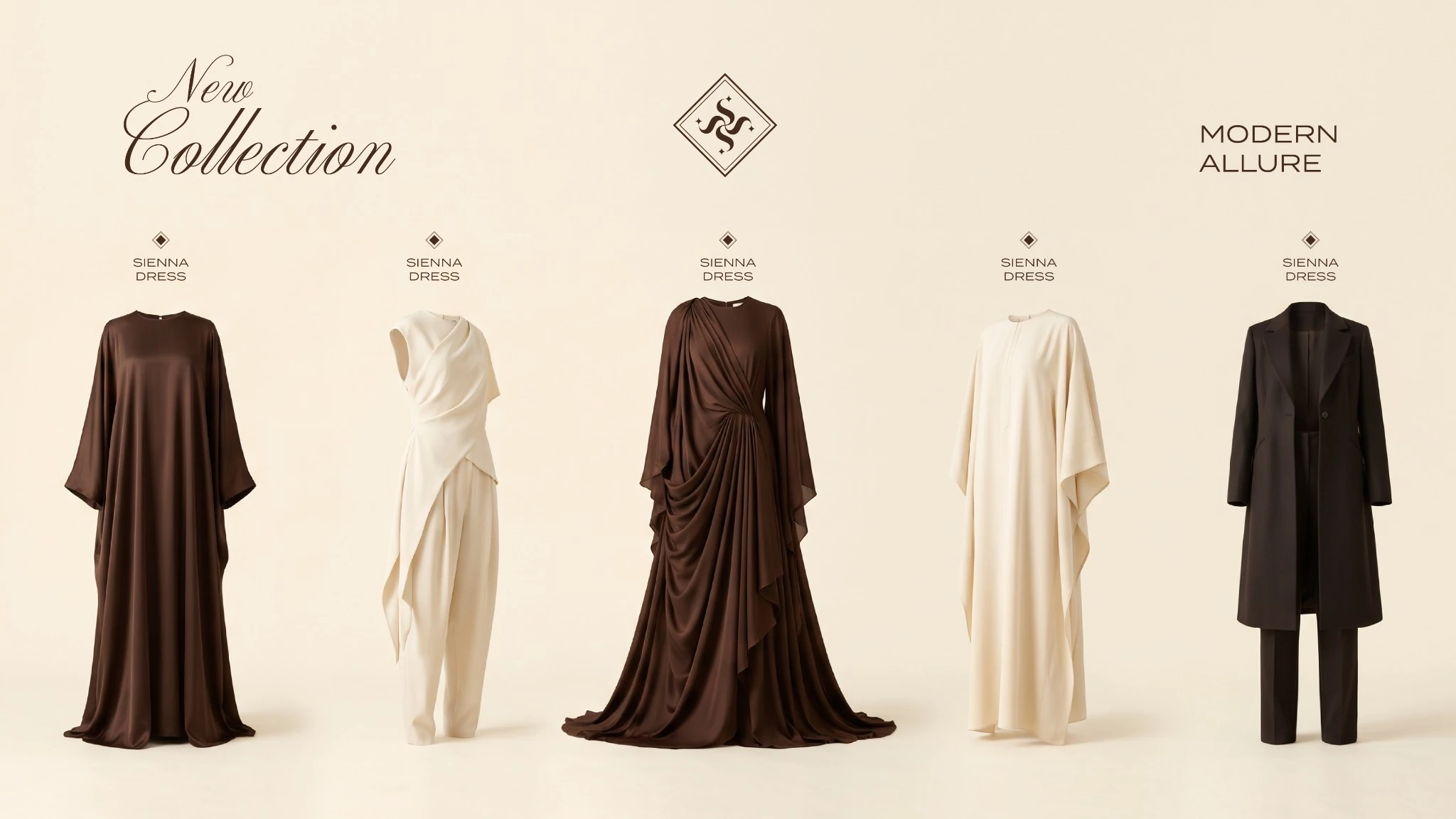
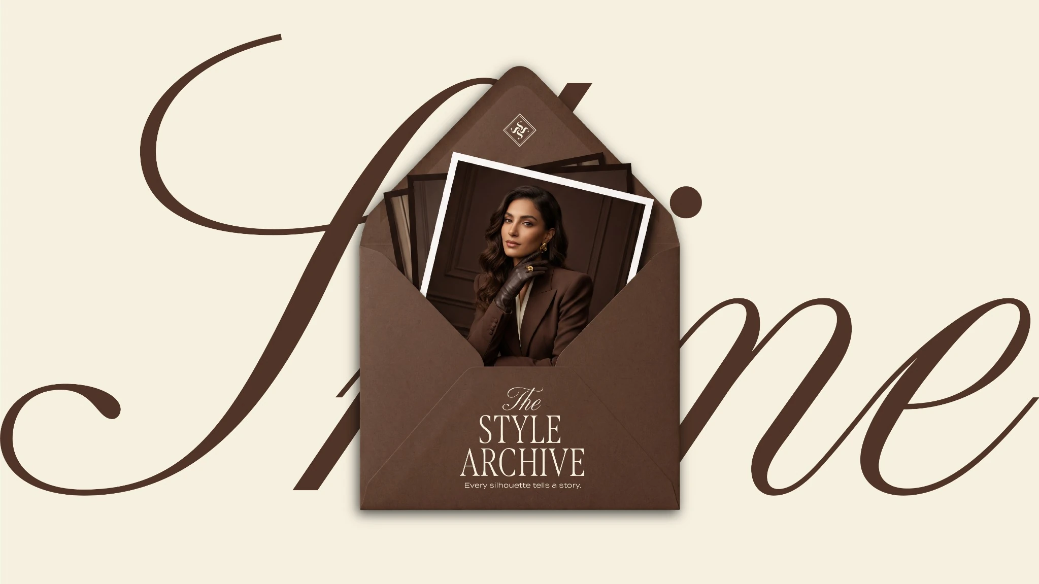
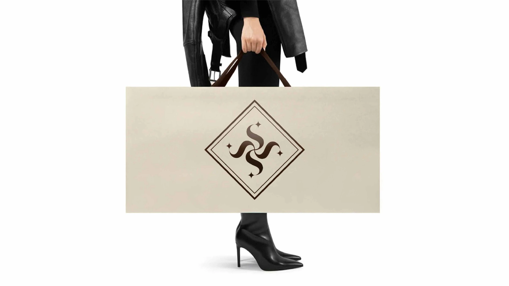
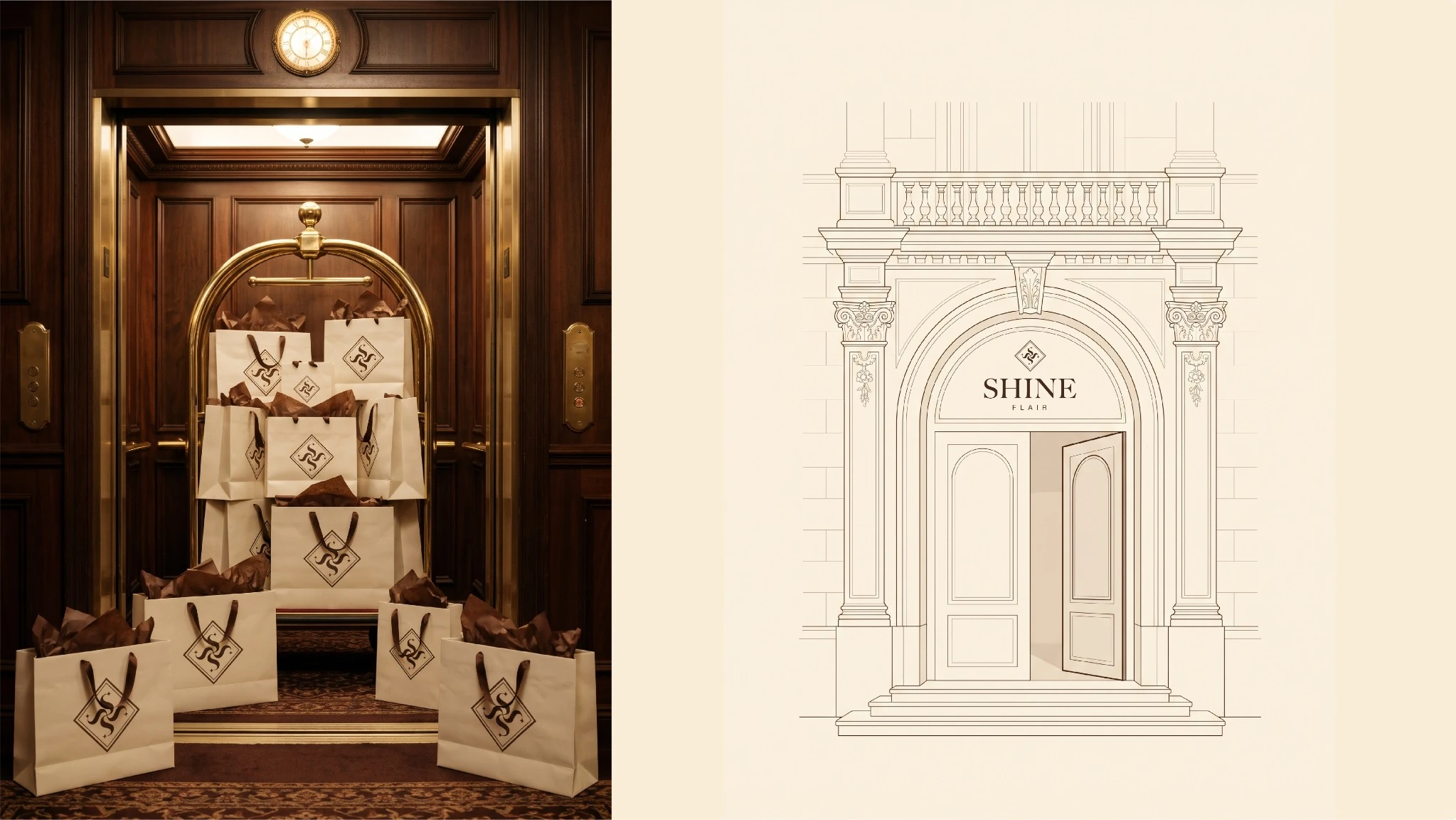
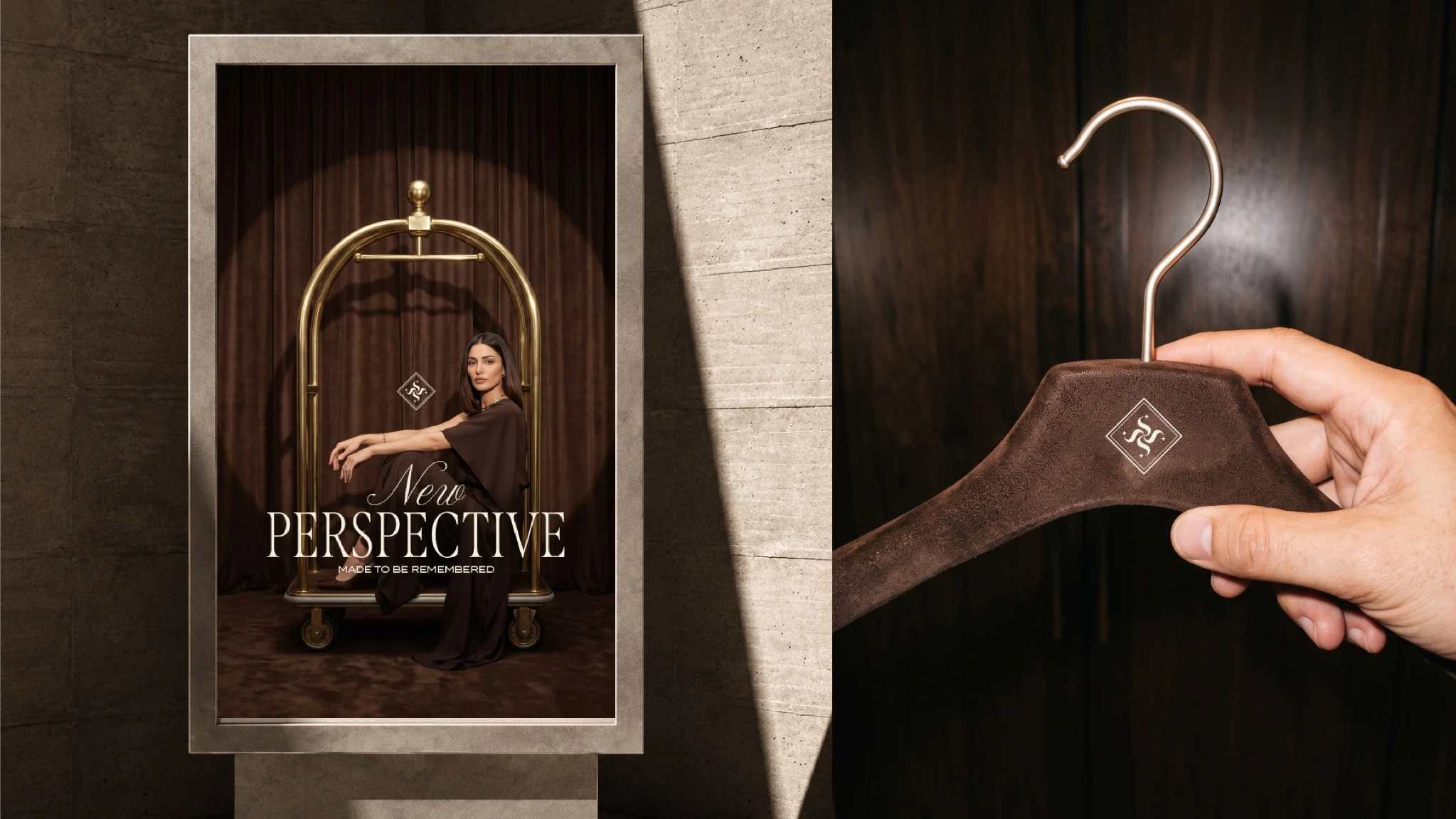
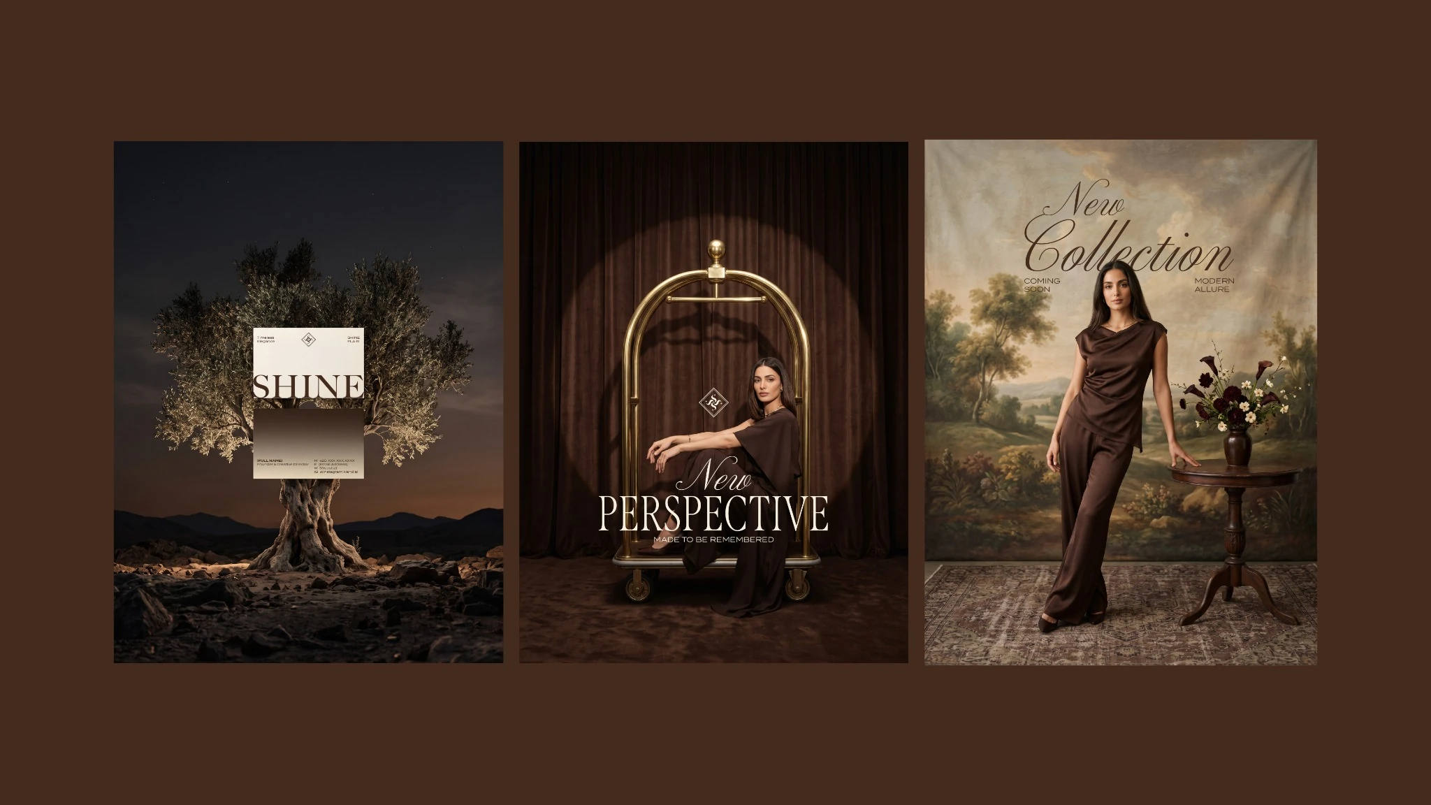
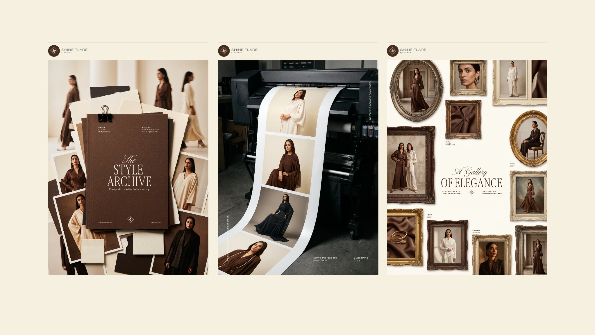
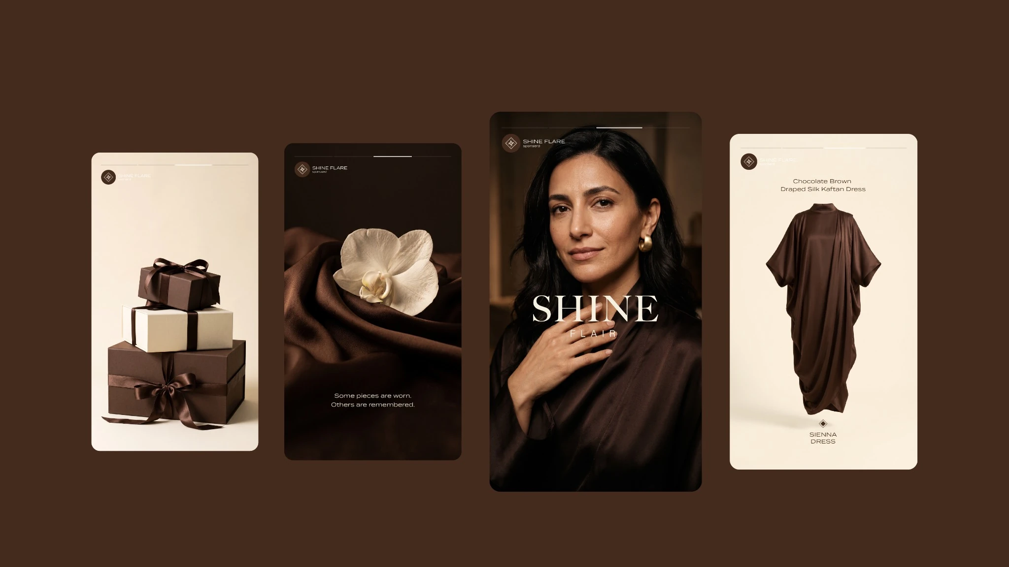
Repeated S forms and four shine points create a diamond-framed emblem. A high-contrast serif wordmark is paired with restrained supporting typography. Chocolate brown and warm ivory establish the signature palette, with noir and white providing contrast. Fabric textures, architectural details and framed compositions extend the direction into imagery.
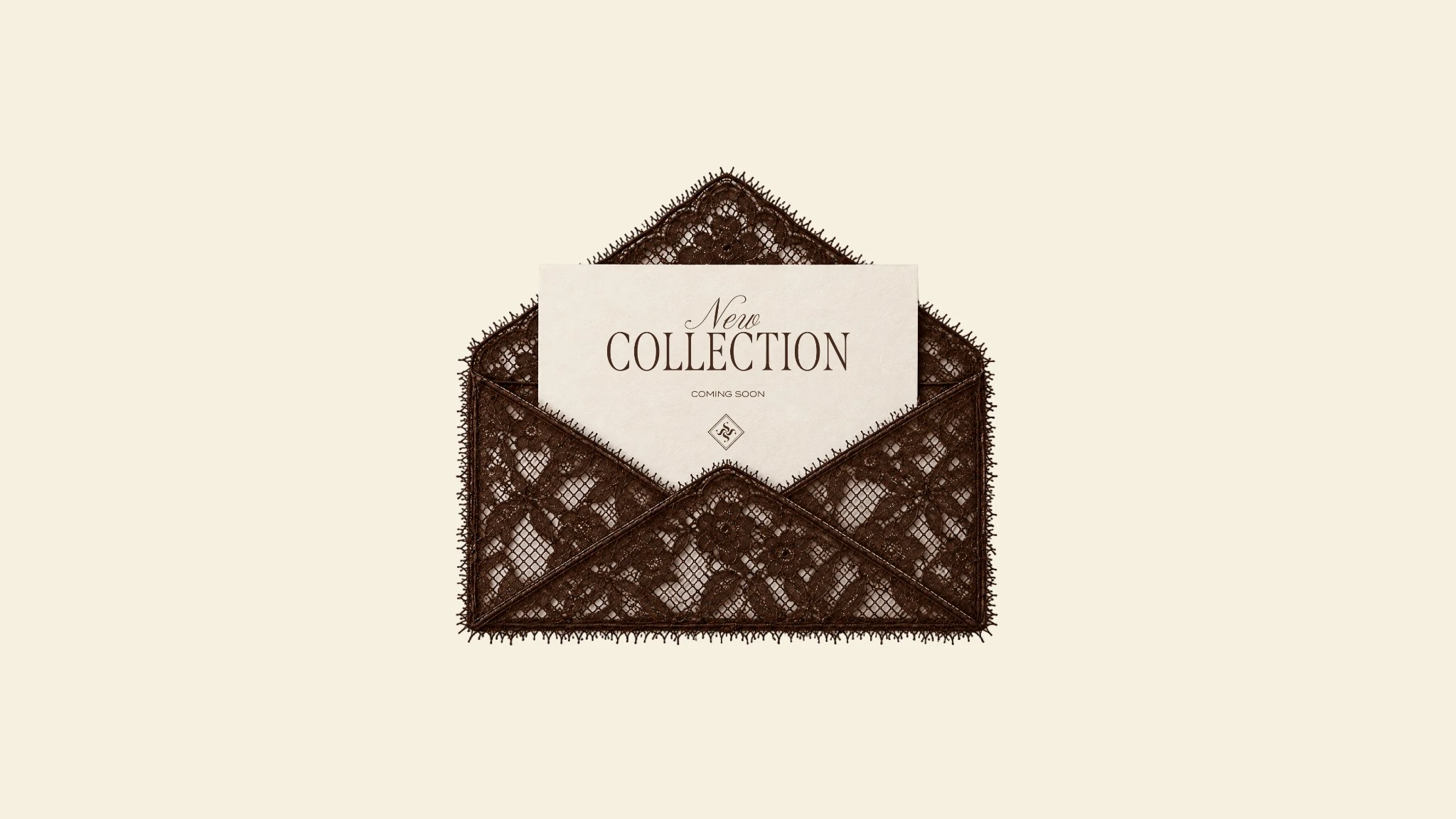
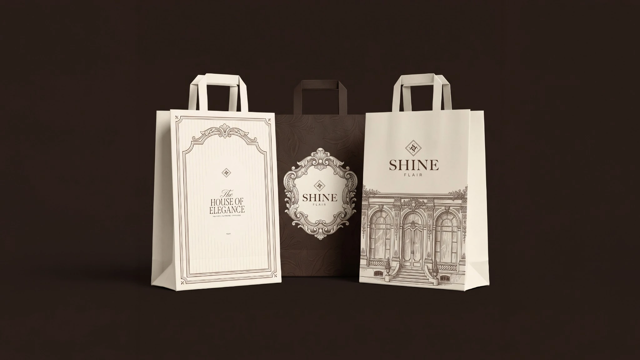
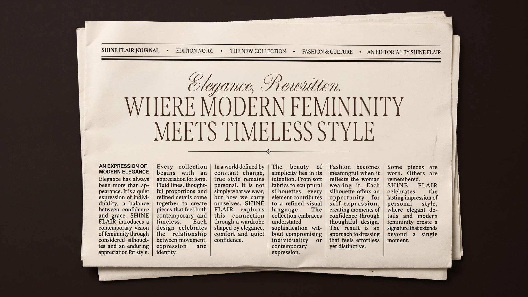
The identity is carried through shopping bags, garment hangers, collection invitations, editorial layouts and social campaign visuals. The style archive and collection presentations give the same system a range of expressions while retaining its palette, emblem and typographic hierarchy.
About this case study This study presents the visual identity and its proposed applications through supplied artwork and mockups.
Planning a project with a similar design need?
EMAIL ABOUT YOUR PROJECT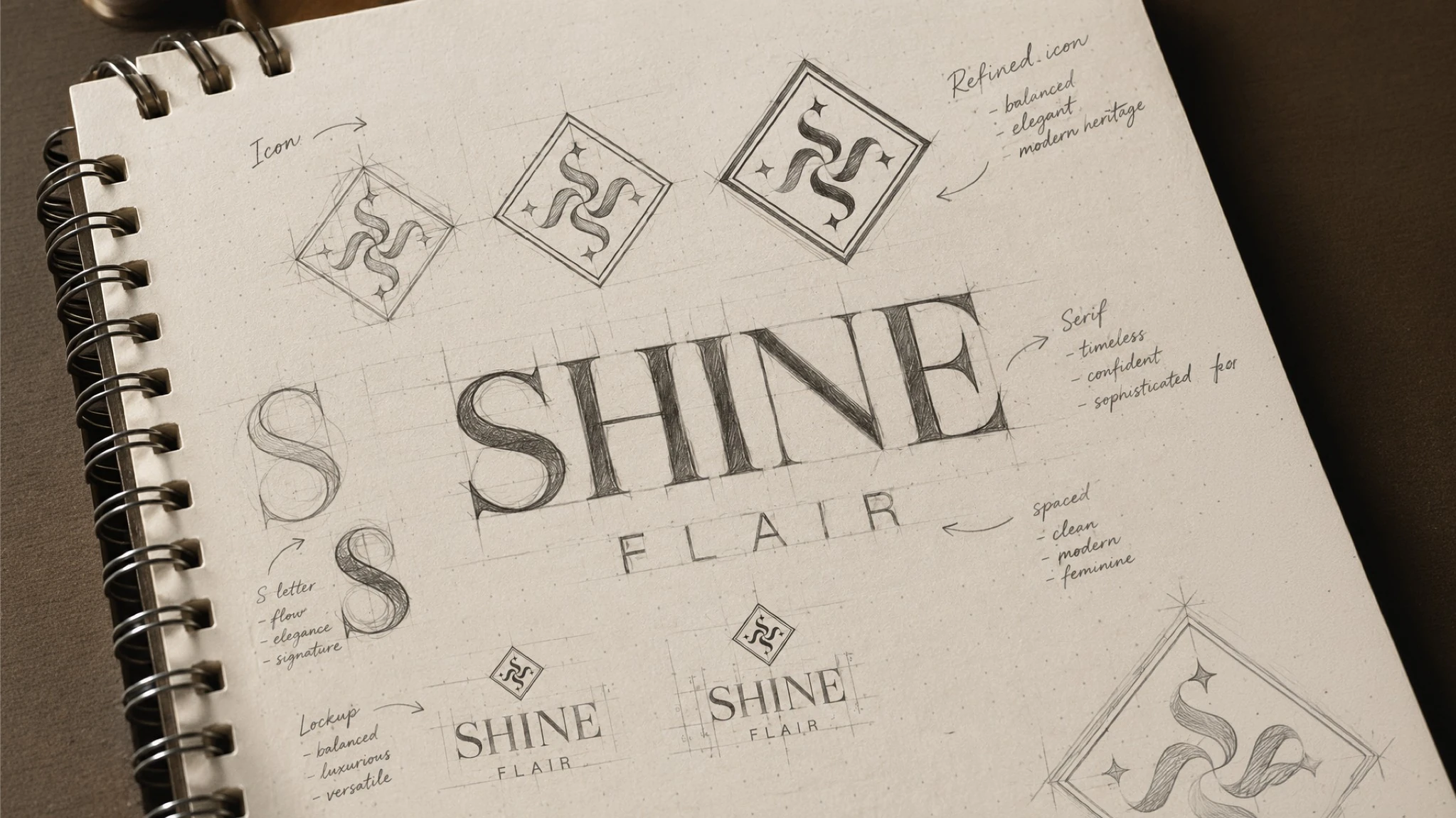
Brand identity, art direction and design — Youssef Zamzam. Supplied campaign imagery and application mockups.