Design focus
Make a range feel like one family while allowing the product and flavour name to change. The design uses repetition deliberately so that variation comes from the item rather than a new layout each time.
 EMAIL ZAM
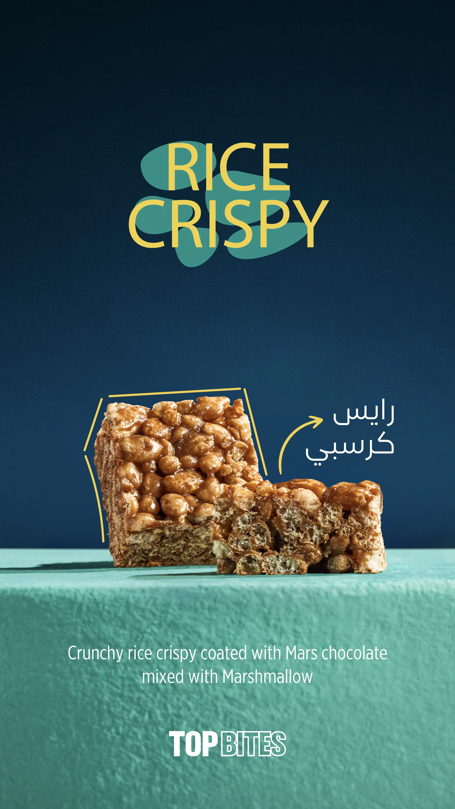
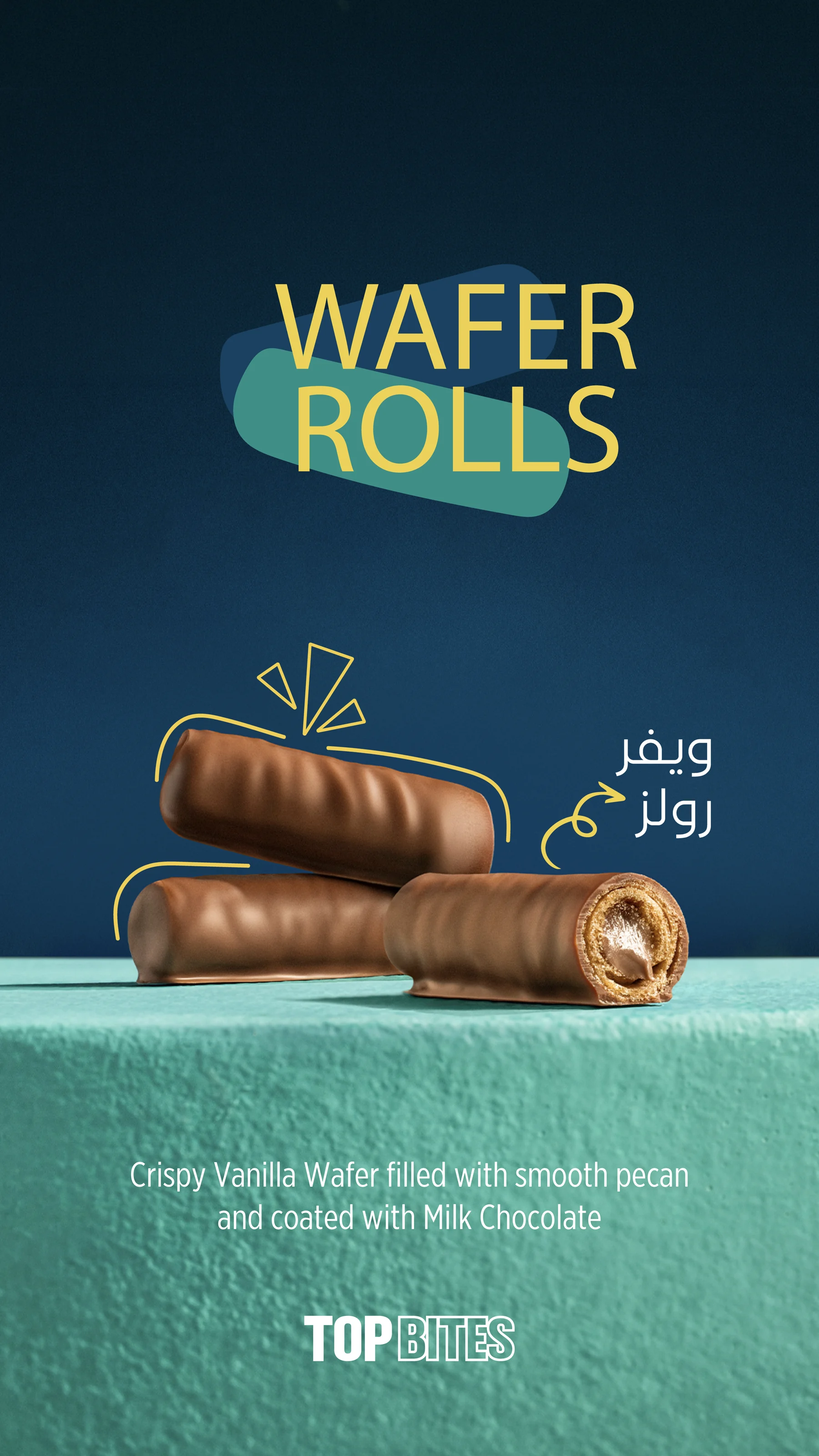
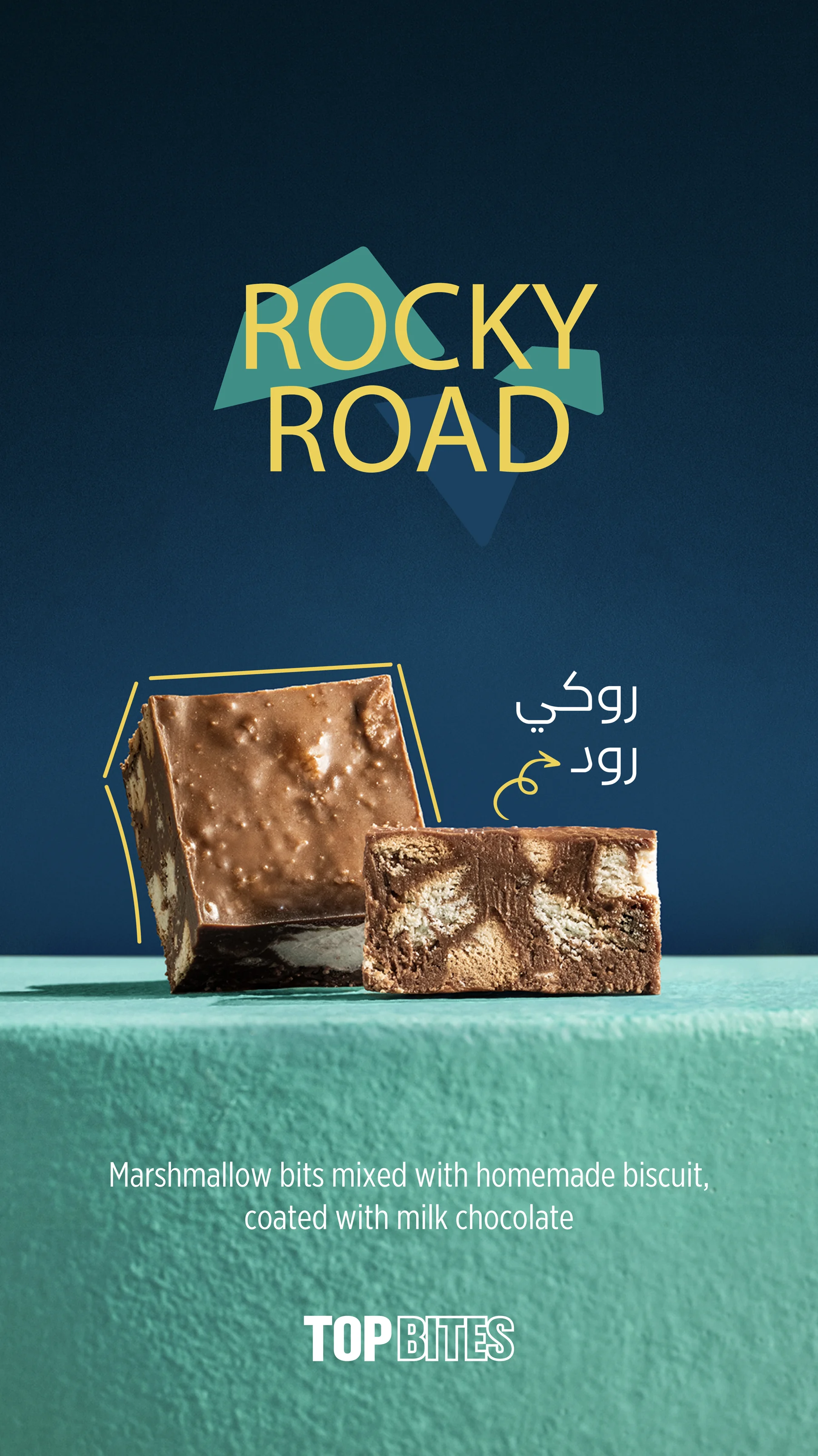
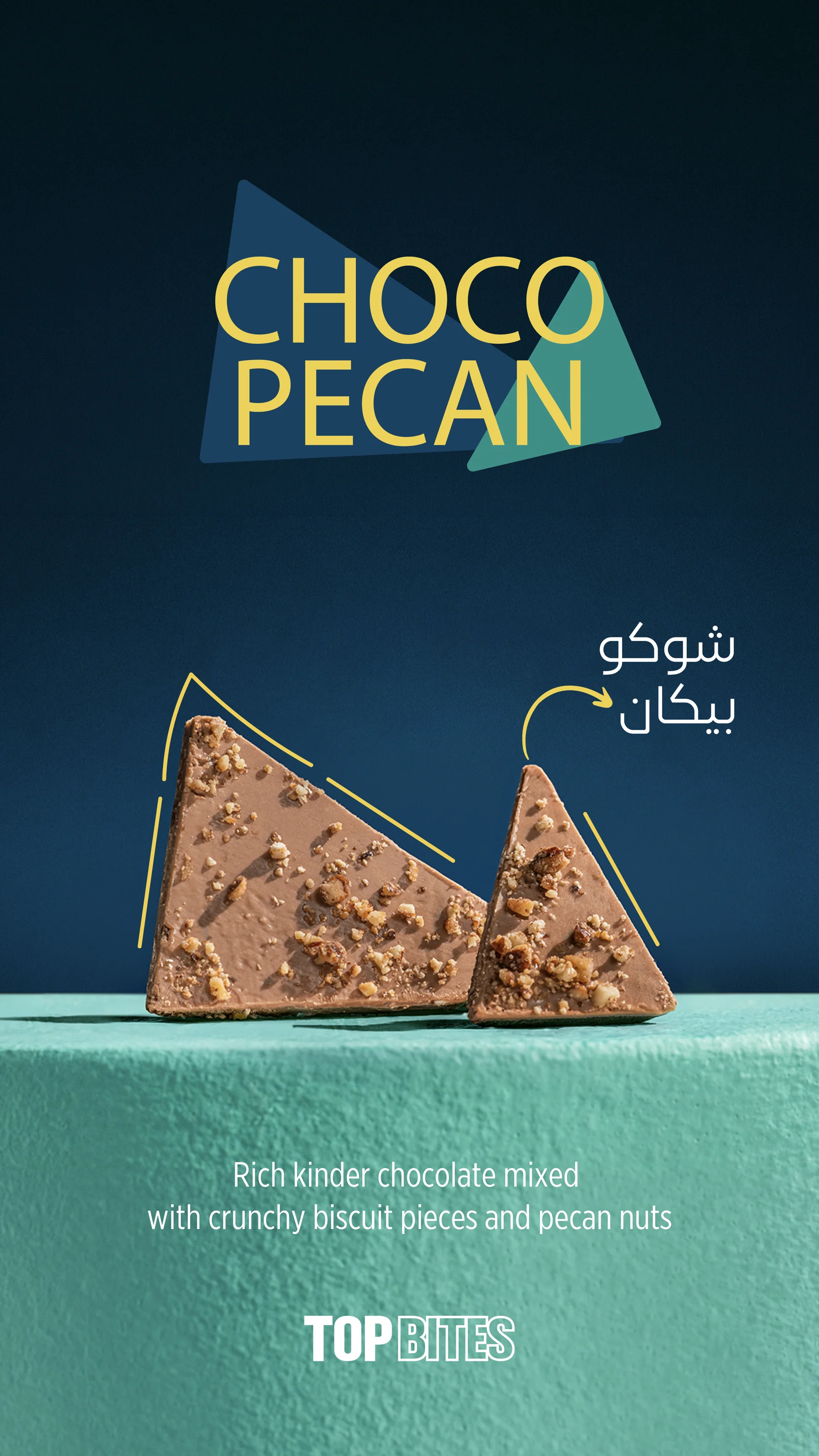
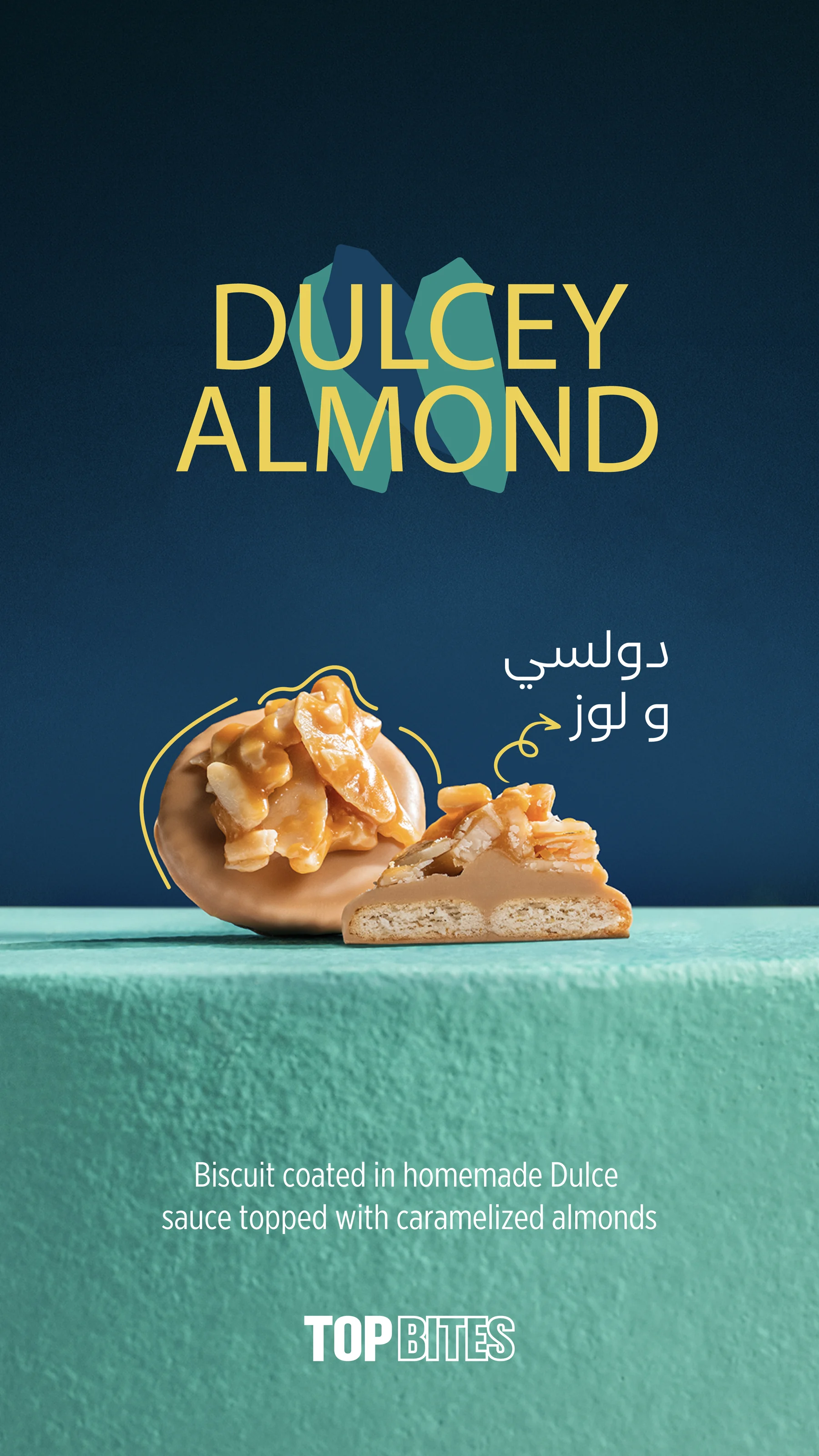
A highly consistent product series using a deep blue-green background, yellow headlines and a textured display surface. Each flavour is introduced through the same recognisable composition.

Make a range feel like one family while allowing the product and flavour name to change. The design uses repetition deliberately so that variation comes from the item rather than a new layout each time.
A large flavour headline leads into a centred product composition. Small illustrated accents add movement, while the consistent horizon and textured surface give the product a stable setting. The palette remains controlled across the full selection.
Eight flavour visuals apply the same composition to different products. A stable headline position, display surface and brand placement make the sequence work as a family, with product imagery providing the variation.
About this case study This case study documents the visual design shown in the supplied artwork. Client commission and publication status have not been confirmed.
Planning a project with a similar design need?
EMAIL ABOUT YOUR PROJECT

Portfolio artwork supplied by Youssef Zamzam.