Design focus
Extend the existing HAVEN identity into a chocolate gift box where the packaging surface, colour and small brand mark work together.
 EMAIL ZAM
A burgundy chocolate box whose surface does most of the talking. Rows of angled lines run across the face, a small gold wordmark sits above them, and a tonal pull tab breaks the silhouette.
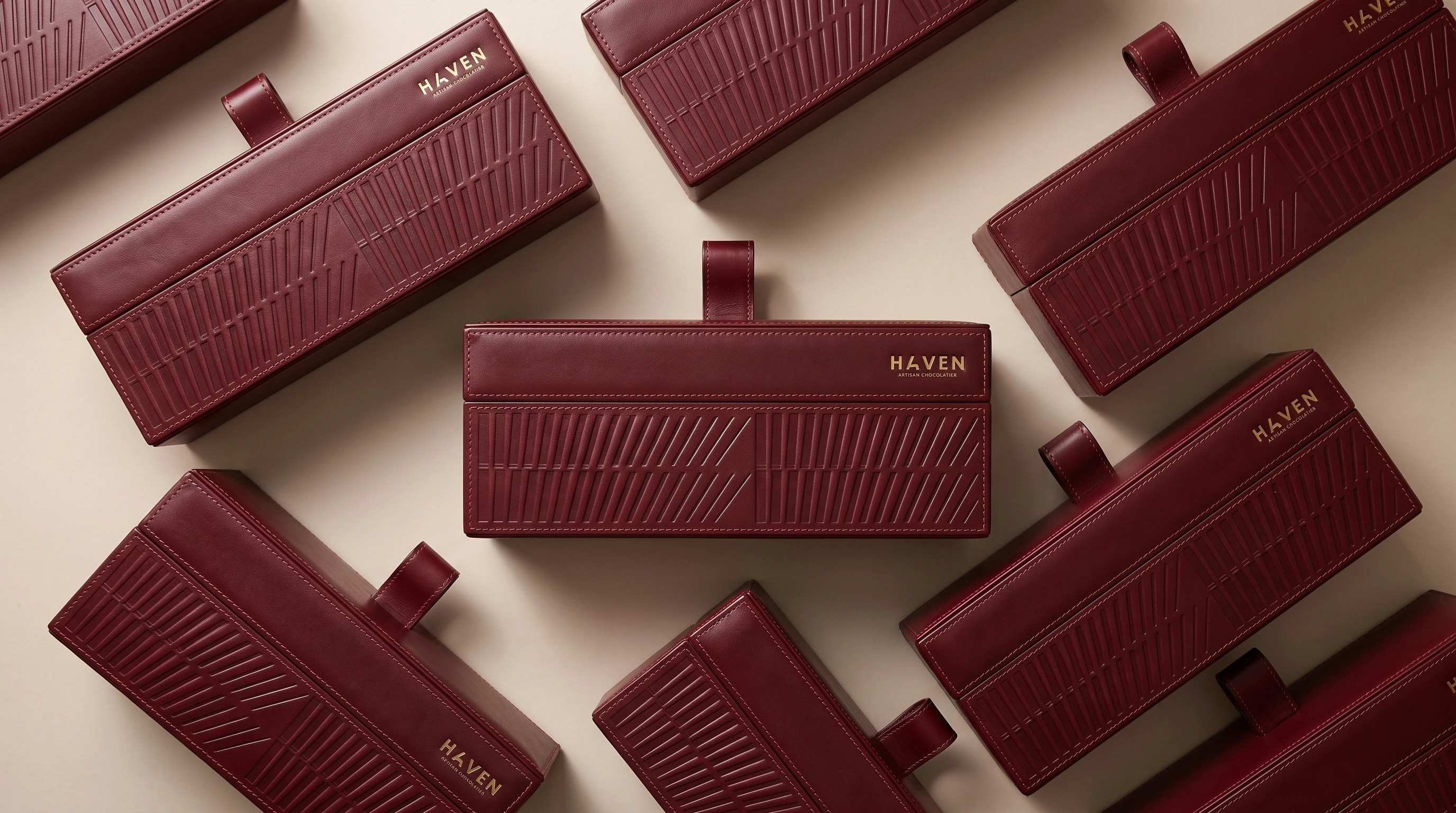
Extend the existing HAVEN identity into a chocolate gift box where the packaging surface, colour and small brand mark work together.
Burgundy provides a continuous field for the diagonal relief. The small gold wordmark gives the design a focal point, while the tonal pull tab breaks the silhouette without introducing another dominant colour.
The shown presentation pairs the gift-box arrangement with a close detail of the relief, stitching and wordmark. The case study demonstrates a packaging direction and its visual details, not measured sales or a confirmed production specification.
About this case study Packaging development by Youssef Zamzam / ZAM Studio. The existing HAVEN identity is credited to Elephantsink. This case study describes the shown artwork, without claiming production details or commercial performance.
Planning a project with a similar design need?
EMAIL ABOUT YOUR PROJECT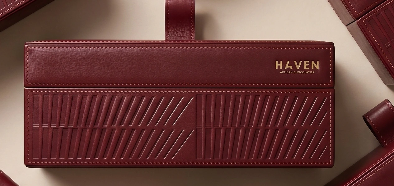
Packaging development — Youssef Zamzam / ZAM Studio. Existing HAVEN identity: Elephantsink.
View the full project on Behance ↗